
White Wall Decor Ideas: Transform Your Space Today
Key Takeaways
- White wall decor ideas shine when you add contrast (black frames), texture (warm woods), and personal stories (photo‑led galleries);
- Plan first, choose a color story and layout, then follow simple rules like the 2/3 sofa width, a 57 inch centerline, and 2 inches between tiles;
- Mixtiles makes decorating with white walls effortless: peel and stick frames go up fast, move without damage, and let you test layouts risk free;
- Style every room (living, bedroom, hallway, office, and bathroom) then refresh seasonally in minutes with new photos or art.
White walls are a design gift: bright, clean, and versatile. But without the right decor, they can feel flat. This guide turns blank space into a beautiful, personal backdrop, using easy, renter‑friendly ideas you can execute today. From balanced gallery walls to small‑space tricks, we show how to add contrast, warmth, and meaning. Best of all, Mixtiles adhesive and repositionable frames make it simple to try layouts, swap photos, and evolve your style, no paint or nails required.
Ready to transform a blank wall? Upload your photos to create custom photo tiles and preview your new picture wall in minutes.
Why do white walls need special styling?
White walls reflect light and magnify shadows, so they need contrast, texture, and personal content to feel warm and designed. A simple mix of dark frames, tactile materials, and meaningful art or photos creates depth without visual clutter.
The decor trifecta for white walls:
- Contrast anchors the eye and gives definition. Try black or charcoal frames, graphic typography, or deep blue photography to create crisp edges that read well against a white wall.
- Texture adds dimension. Warm woods, woven baskets, linen, and matte finishes keep an interior from feeling sterile.
- Story makes a room with white walls feel like your home. Travel memories, family portraits, kids’ art, or fine art prints turn a blank wall into a lived‑in space with meaning.
What are the best white wall decor ideas for living rooms?

Start with an easy focal wall and scale decor to your furniture. For a sofa wall, choose a tight grid or a single bold piece. Around a TV or mantel, use symmetry to keep the look calm and intentional. These approaches work in small living rooms and large open‑plan spaces. If you need help picking proportions, check our guide on how big should art be on a wall for sofa and console pairings.
Above‑the‑sofa gallery: balanced, not busy
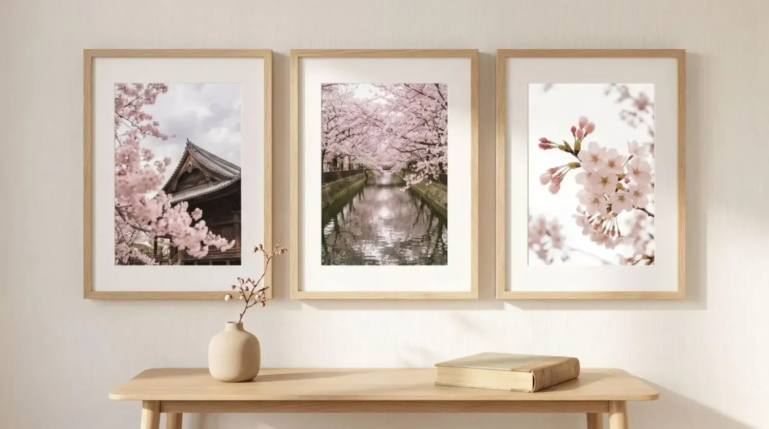
Size your display to about two thirds of the sofa width so the arrangement feels connected to the furniture. A 3 by 2 or 4 by 3 grid of Mixtiles keeps lines straight and spacing clean, which is perfect for a minimalist style with white walls. If you love an eclectic look, you can still maintain order by aligning the bottom row to one clean line and repeating one frame color.
One bold focal point vs. a tight grid
An oversized canvas print or a dramatic panoramic photo brings sculptural presence to a white wall. If you prefer modular flexibility, a grid of 6 to 12 tiles gives the same impact while letting you swap images through the seasons.
Mantel and media wall moments
Flank a TV or fireplace with pairs or trios of tiles for balance. Black frames look sharp against white, and a few warm wood accents on the mantel stop the room from feeling stark. Keep side clearances even so the arrangement feels intentional, not improvised.
How can I decorate a white wall in the bedroom?

Bedrooms benefit from calm symmetry and soft palettes. Keep the layout centered to the headboard and use soothing colors so the space feels restful. A narrow wall can handle a vertical stack or a triptych that draws the eye upward.
Above the bed: calm symmetry
Try a row of three to six tiles centered to the headboard width. Black and white photos, muted botanicals, or sepia portraits read softly with white walls and linen bedding. If your ceiling is high, add a second row for a more proportionate look.
Cozy textures and tone‑on‑tone
Blend a wood frame finish with a wool throw and a woven rug to add tactile warmth. A pale sand or taupe palette works beautifully with white. The result is a bedroom that feels serene and designed without heavy color.
Small primary or guest rooms
On a narrow wall, a vertical triptych feels elegant. In a corner, stagger two short columns of tiles at different heights to animate the space without crowding it. These decorating ideas keep sightlines open in compact rooms.
What if I rent or have small spaces?

You can decorate freely without risking walls. Mixtiles use a gentle adhesive or magnet system that lets you stick, restick, and remove cleanly, which is ideal for rentals, dorms, and micro apartments.
Renter‑friendly, damage‑free solutions
Skip nails and spackle. Learn exactly how to hang wall art without nails for a damage‑free setup. Mixtiles are lightweight and designed for painted drywall, many textured walls, wood paneling, and even brick or wallpaper in many cases. If the surface is very rough, press firmly for a few seconds to help the adhesive grip. When moving out, remove tiles by lifting upward and parallel to the wall for a clean release.
Make tight spaces feel bigger
Use bright imagery and consistent spacing so the eye reads one clear grid. A vertical stack near an entry or beside a wardrobe draws the gaze up, which increases the sense of height. Mirrors and glossy decor nearby will bounce light back onto your white wall.
Corners, columns, and doorways
Wrap a gallery around a corner to create dimension in a small living room with white walls. Slim two‑tile columns on each side of a doorway frame the opening and make a simple hall look finished.
How do I plan a gallery wall that actually looks good?
Choose a theme, pick a layout, then map it before hanging. A few simple measurements keep everything aligned and proportional to your furniture. With white walls, order and spacing matter because shadows and highlights are more visible.
Step 1: Pick a theme and color story
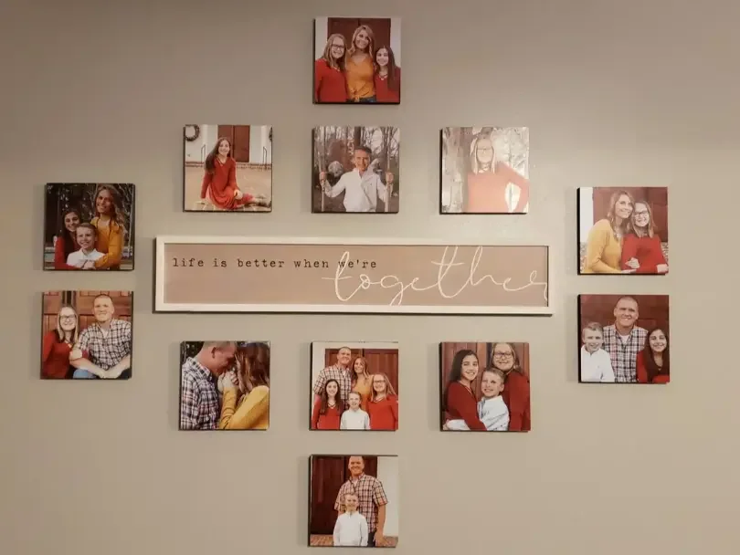
Unify your wall with a shared palette or subject. Black and white travel photos, family portraits in warm neutrals, or a coastal set of blues are easy themes that look clean with white walls. If you mix subjects, repeat one color across several images so the eye connects them.
Step 2: Choose a layout, grid or freestyle
A grid feels calm and modern, while a freestyle arrangement feels collected. Both work on a white wall. If you are new to hanging art, start with a grid for predictable results. Mixtiles Gallery Wall Kits include templates that remove the guesswork. For visual templates and spacing tips, read our step by step on how to arrange art on a wall.
Step 3: Map it before you stick it
Arrange tiles on the floor first and photograph the layout for reference. Mark the center point on the wall and build outward. If you are using a magnet system, place the wall magnets according to your plan. If you are using adhesive backs, expose the adhesive only after you mark spacing with painter’s tape.
Spacing and sizing that just work
The guidelines below keep a clean look that suits most interiors. Use the table to set consistent spacing, which is critical on a white wall because small gaps are more visible. Wondering about eye level and exceptions? See our guide on how high to hang art on a wall to adapt the 57 inch rule to your space.
|
Guideline |
Inches |
Centimeters |
Applies to |
|---|---|---|---|
|
Eye‑level centerline height |
57 |
145 |
Most galleries on standard walls |
|
Gap above furniture |
6 to 8 |
15 to 20 |
Bottom row to top of sofa or console |
|
Spacing between tiles |
2 |
5 |
Grids and tight groupings |
|
TV clearance on each side |
3 to 6 |
8 to 15 |
Frames flanking a screen |
|
Hallway row height from floor |
60 to 62 |
152 to 157 |
Single‑row runs in corridors |
Quick formulas
Size the gallery to roughly two thirds of the furniture width so the arrangement feels connected rather than floating. On tall walls, add rows before widening the layout so proportions stay vertical and elegant. Keep tile spacing identical throughout for a polished look.
Design your layout risk free. Order our repositionable canvas photo prints and move each piece until your gallery feels perfect, no tools required.
Which colors and materials pair best with white walls?
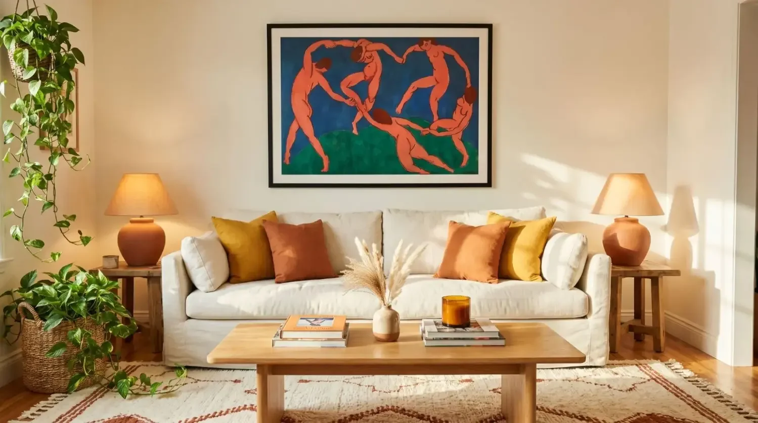
High contrast and warm materials are your best friends. Black frames, charcoal mats, and bold typography ground the look. Wood tones, brass accents, and botanical prints add warmth and texture so the room feels welcoming rather than clinical.
- High‑contrast classics: Black frames around black and white photos are a timeless interior combination that looks graphic without being loud. If your furniture is pale, the contrast keeps everything readable and stylish.
- Warm and natural: Walnut, oak, rattan, and linen soften the light on white walls. A few botanical or landscape prints in muted greens bring a calm, organic feel to the space.
- Polished accents: Brass or gold accessories in nearby lighting or decor add a soft glow. A matte print surface prevents glare so your art is easy to view from different angles in the living room.
- Creating a cohesive palette: Choose one or two dominant hues and repeat them across photos or art. This simple strategy connects pieces from different trips or years into one cohesive story.
Can I mix photos, art, and textures on white walls?
Yes, and it looks sophisticated when you repeat one element such as frame color or subject. Alternate personal photos with abstract art or line drawings, and keep finishes matte to reduce reflections on white walls.
Curated mix that feels intentional
Place a portrait beside a minimal abstract, then echo a shared color in both. A family timeline paired with a few fine art prints gives an elevated, personal look.
Add depth without clutter
Vary zoom levels. Mix close‑ups and wide landscapes to create rhythm. With white walls, even small changes in scale read clearly, so keep margins and spacing consistent.
Mirrors, shelves, and ledges
A narrow picture ledge below or above a row of tiles adds a subtle layer for books or small objects. A mirror opposite a window will throw more daylight across your art.
What are room‑by‑room white wall decor ideas I can copy today?
Pick one wall per room and apply a simple, scalable layout. Repeat frame color throughout the home so the design flows from space to space.
Entryway or hallway

Create a linear row at about 60 to 62 inches from the floor. A family timeline in chronological order guides guests through your story as they move from the door to the living area.
Kitchen and dining

Try a 2 by 3 grid of recipe photos, markets from your travels, or black and white cafe scenes. The tight format looks clean above a buffet or banquette.
Bathroom

Use coastal or spa imagery and keep tiles out of direct steam. Matte prints resist glare from mirrors and bright lighting.
Home office

Build a motivation wall with quotes, wins, and family photos in a 3 by 3. It keeps your focus on what matters through the workday.
Kids’ rooms and nurseries

Rotate art as they grow. Mixtiles make seasonal swaps simple so the room stays fresh without repainting or patching holes.
What common mistakes should I avoid on white walls?
A few small tweaks prevent the most common issues:
- Do not hang too high or too small, because white space will overpower undersized art.
- Keep the centerline near 57 inches and scale the overall width to about two thirds of the furniture below.
- Reduce visual clutter by repeating frame finishes and a limited color palette.
- Use a spacer or painter’s tape to maintain a consistent 2 inch gap.
- Skip nails so you do not create holes you will regret later. Mixtiles stick, restick, and come down cleanly.
How do Mixtiles make white wall decor effortless?
Mixtiles are purpose‑built for fast, beautiful walls. The D2C experience is simple, from upload to delivery, and the products are lightweight and consistent so you get a premium look without tools.
No paint, no holes, no stress
Peel and stick tiles or magnet‑mounted options protect walls in rentals and owned homes. Installation takes minutes and there is no damage when you remove or move them.
Test, tweak, and refresh anytime
Reposition in seconds until spacing looks perfect. Swap new photos for holidays or milestones and keep your white wall inspiration current all year.
Premium look, predictable results
Consistent sizing, clean edges, and a matte finish create a gallery look on white walls that looks beautiful. If you prefer a statement piece, choose Canvas Tiles for large art or go with Gallery Wall Kits for a ready‑to‑hang layout.
Fast, friendly D2C experience
Create on the website or the app. You can upload from your phone, Google Photos, or Google Drive. Explore Photo Books for gift ideas and Fine Art prints when you want curated art to the same size and style as your photos.
White walls are a blank canvas, so make them meaningful with contrast, texture, and personal stories. With Mixtiles, you can peel, stick, and style until your layout is perfect. Then refresh it whenever inspiration strikes. Whether you are in a rental, a dorm, or your forever home, these white wall decor ideas will help you design a bright, warm space you love without nails or paint.
Start your white wall transformation today. Create your first set of picture tiles, preview layouts instantly, and enjoy fast delivery with free shipping on many orders.
Frequently Asked Questions
What looks best on white walls?
White walls shine with contrast, texture, and personal stories. Try black or charcoal frames, warm woods, and meaningful photos or art. A tight grid or calm symmetry keeps things polished, and peel-and-stick frames let you refine spacing without damage.
What is the 3-5-7 decorating rule?
It is a guideline that favors odd-number groupings, which feel balanced and natural. On walls, build sets of 3, 5, or 7 frames. Keep spacing consistent, about 2 inches, center the display near 57 inches, and size it to roughly two thirds of the furniture width.
Which colors pair well with white walls?
High-contrast tones like black, charcoal, or navy add definition. Warm materials such as oak, walnut, and brass bring coziness. Soft neutrals, sand and taupe, and organic greens create a serene look. Repeat one or two hues across pieces for a cohesive palette.
What is the 3-4-5 rule in decorating, and how can I use it on walls
Many stylists use 3, 4, or 5 items to create variety without clutter. On walls, try 3 frames for small nooks, 4 for calm symmetry, and 5 above a sofa. Keep 2-inch gaps, a 57-inch centerline, and align the overall width to your furniture.
Be the first to know — deals, news & decor ideas.
By clicking you agree to the Terms of Use & Privacy Policy