
Black and White Photography Wall Art: Create Your Gallery
Key Takeaways
- Black and white photography wall art adds timeless contrast and clarity to modern and traditional rooms alike;
- Choose strong subjects and textures, then plan scale and a clean layout that suits your wall and furniture;
- Light, framing, and spacing transform monochrome prints from simple photos into fine art focal points;
- Mixtiles turns your photos into peel and stick, repositionable framed tiles you can hang in minutes with no damage.
Black and white photography wall art never goes out of style. By stripping away color, monochrome images spotlight story, shape, and emotion, making any space feel curated and calm. Whether you love street scenes, family portraits, abstract textures, or minimalist architecture, the right balance of contrast, scale, and layout turns your walls into a gallery wall you will love. In this guide, you will learn how to choose, size, and arrange black and white art, and how Mixtiles helps you build a renter friendly gallery in minutes.
Create your black and white gallery now. Turn your photos into stylish photo tiles with our peel and stick, damage free frames.
Why does black and white photography wall art feel so timeless?
Black and white simplifies the palette so the eye follows light, shadow, and form. This clarity highlights texture in architecture, movement in street photography, and detail in nature. The result is calm and sophisticated, and blends with contemporary and vintage styles in any home.
Because the tones are neutral, black and white complements wood, metal, and fabric finishes without clashing. It supports bold accent colors or a minimalist black and white room. Trends change, yet monochrome remains a steady style anchor you can build on as your collection grows.
Which rooms are best for black and white wall art, and why?
Monochrome works everywhere. Choose subjects and layouts that match each room’s function and mood, from a quiet bedroom to a dynamic living room.
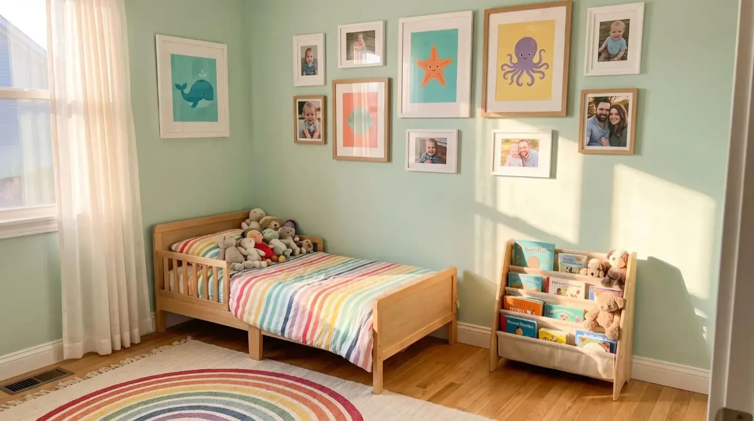
Living room

Center a large hero print above the sofa, then echo its style with tiles on either side. Abstract art and landscape prints create a relaxed focal point, while city views or Paris architecture add an urban edge.
Bedroom

Keep it soothing. Try white prints with soft contrast and nature motifs above the headboard. A balanced 3 by 3 grid feels orderly and restful, perfect for a minimalist style.
Entryway and halls

Use a linear series to guide movement down a hall. Vintage portraits, travel photography, or one continuous landscape sequence build narrative as guests move through your home.
Home office

Choose subjects that energize focus, like architecture lines, typography, or featured artists you admire. Keep spacing tight for a crisp, contemporary look that reads as professional on video calls.
How do you choose the right photos for a striking monochrome look?
Look for clear subjects, textured surfaces, and compelling light. Strong shadows and highlights bring shape forward. If a photo looks great in grayscale on your phone, it will likely print beautifully as wall art.
Subjects that shine in black and white
People, architecture, nature, and abstract details translate especially well. Think candid portraits, art deco facades, a misty landscape, or the grain of a wooden table in your kitchen. These subjects emphasize form and texture, which is the essence of black and white photography.
What makes a photo “pop” in monochrome?
High quality light, a defined focal point, and confident contrast. Side light over a face or across a marble staircase adds dimension. Avoid cluttered backgrounds so the subject reads clearly when viewed from across the room.
Composition that converts well
Use the rule of thirds to place eyes or key details off center for tension. Lean into leading lines, like roads and railings, to guide the viewer’s gaze. Give subjects breathing room with negative space so your print looks intentional at scale.
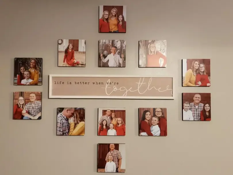
Curate a cohesive story
Unify your collection of black and white prints by mood, era, or editing style. For example, mix several contemporary street shots with consistent contrast, or pair family portraits with white mats for a museum feel. Consistency beats perfection and makes the gallery look designed as one set.
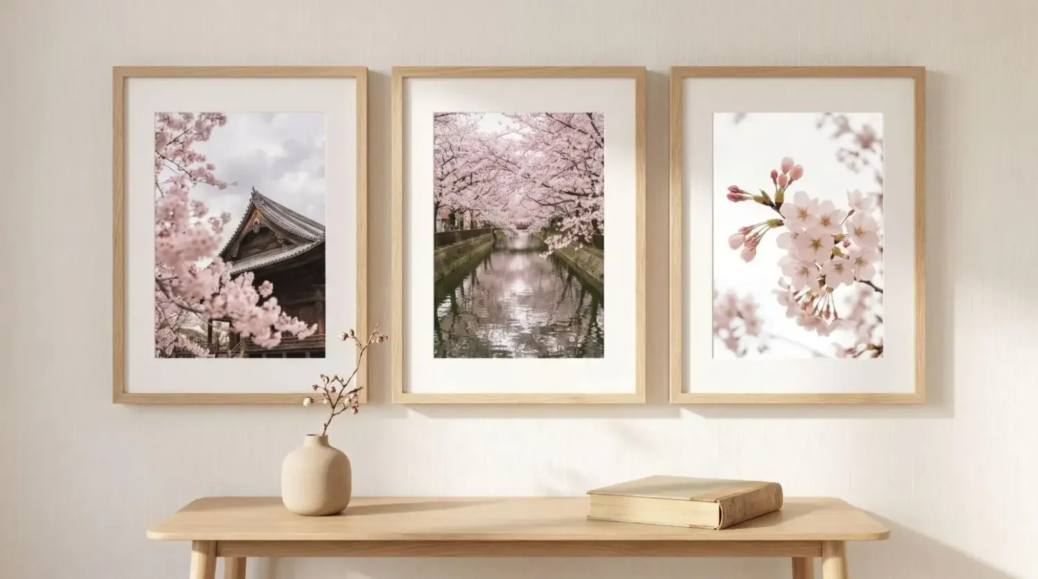
What sizes and layouts work best for a black and white gallery wall?
Match scale to wall width and key furniture. Grids feel modern and polished. Eclectic salon layouts suit collected homes. Keep spacing consistent so the gallery reads as a single artwork.
Smart scale by wall type
Small walls often suit three to six tiles, medium walls handle six to ten, and large walls shine with nine to sixteen or more. If you hang over a sofa or credenza, cover roughly two thirds of the furniture width for balance.
Layouts that always look good
Try a 3 by 3 grid for symmetry in a living room, a 4 by 3 layout above a dining table, or a clean linear row for a contemporary hallway. A salon mix of sizes feels curated and is great for a personal collection that evolves over time.
Spacing and alignment tips
Center artwork at roughly 57 to 60 inches to the midline for most rooms. Keep gaps even so the wall reads as one composition. Mixtiles are easy to realign, which helps you perfect spacing without nails.
Scale to furniture
Leave a few inches of white wall between the bottom of your lowest tile and the top of furniture. This negative space frames the gallery and prevents a crowded feel.
Quick sizing guide for gallery walls using Mixtiles
|
Wall width |
Recommended tile count |
Typical layout |
Approx coverage, inches |
Approx coverage, cm |
|---|---|---|---|---|
|
36 to 54 in |
3 to 6 |
Single row or 2 by 3 grid |
24 to 40 wide by 12 to 28 high |
61 to 102 wide by 30 to 71 high |
|
55 to 84 in |
6 to 10 |
3 by 3 or 4 by 3 grid |
36 to 56 wide by 24 to 40 high |
91 to 142 wide by 61 to 102 high |
|
85 in and wider |
9 to 16+ |
4 by 3 or salon mix |
56 to 80 wide by 36 to 56 high |
142 to 203 wide by 91 to 142 high |
Should you frame black and white photography, and how do you pick the right look?
Framing elevates monochrome art prints, adding structure and contrast. Choose a finish that matches the room’s style and consider a printed mat for a gallery effect.
Frame finishes and mats
Black frames create drama and pair well with high contrast images. White frames feel airy and contemporary. Wood adds warmth in living room and kitchen spaces. Optional printed mats increase negative space, bringing a fine art vibe without the weight of glass.
Keep it cohesive
Repeat one finish for a museum clean wall, or alternate two finishes in a pattern for subtle variety. Consistency in frame depth and spacing unifies mixed subjects into one gallery.
Damage free hanging for renters
Mixtiles use a gentle adhesive or magnetic system designed for flat, painted walls. They can work on textured surfaces and paneling too. Each tile is lightweight and easy to clean with a dry cloth. Install, remove, and move them without tools or holes, a renter friendly service that protects your home.
Turn your favorite moments into a museum clean monochrome gallery. Upload your photos to create beautiful custom canvas prints and design your layout in the Mixtiles app.
How do Mixtiles make black and white gallery walls effortless?
Mixtiles simplifies everything, from upload to install. You design on the website or app, select frame styles and sizes, then hang your wall art in minutes.
Create in minutes
Upload from your camera roll, Google Photos, or iCloud. Choose framed tiles, canvas prints, or curated Gallery Wall Kits. Preview how square and rectangular formats look together before you order. If you are new to the format, learn what photo tiles are, then follow our tutorial on how to make photo tiles to design your set with confidence.
Repositionable, renter friendly install
Peel, stick, and straighten. If spacing is off, lift and rehang. The adhesive holds tight yet removes cleanly. No nails, no tools, no stress. When you are ready to put them up, follow our step by step guide on how to hang photo tiles for clean, even spacing.
Edit without the guesswork
Test a 3 by 3 grid versus a salon mix digitally. Add a Wall Sign for a title, or expand your collection with fine art prints from featured artists and licensed products. When your monochrome wall is complete, consider a matching Photo Book to archive the full story.
Black and white photography wall art gives your home an instantly curated feel that is clear, calm, and timeless. Start with strong images, scale them to your wall, then use clean layouts, thoughtful lighting, and cohesive framing for a gallery grade result. With Mixtiles, you can design, hang, and refine a monochrome gallery in minutes. No tools. No holes. Just a beautiful collection you will love living with.
Build your black and white photo gallery wall today. Explore our collection of wall arts and design your perfect layout in the Mixtiles app, mess free.
Frequently Asked Questions
What is the best way to decorate a wall with black and white photos?
Start with a cohesive edit, consistent black or white frames, and a simple layout. Consider a white wall for airy contrast or a deep accent wall for drama. Hang at 57 to 60 inches to center, keep 2 to 3 inch gaps, and use Mixtiles to refine spacing.
What is the rule of thirds, and why does it matter for wall art?
The rule of thirds divides an image into a 3 by 3 grid. Placing key elements near the intersections creates balance and energy. When printing wall art, crop to honor this placement, leave negative space, and your black and white images read clearly from across the room.
Who are iconic black and white artists to inspire a gallery wall?
Look to Ansel Adams, Dorothea Lange, Henri Cartier-Bresson, Fan Ho, and Michael Kenna. Their focus on light, form, and decisive composition translates beautifully to home galleries. Use their work as stylistic cues, then print your own photos with similar contrast and clarity to build a cohesive wall.
Be the first to know — deals, news & decor ideas.
By clicking you agree to the Terms of Use & Privacy Policy