
Creative Photo Book Cover Ideas: Design Your Story
Key Takeaways
- Start with a clear story and one strong focal image, then add a concise, emotive title for instant impact;
- Match cover design to your theme: wedding, travel, baby, or year-in-review, and keep typography readable;
- Prepare files for print: high-resolution photos, correct bleed and safe area, and finishes that fit your style;
- Let your hero image live bigger: create a coordinating Mixtiles gallery you can stick, re-stick, and refresh anytime.
Your photo book cover sets the tone for everything inside. It should make people want to pick it up, flip through, and feel the story before reading a single caption. In this guide, you will find photo book cover ideas for every theme, plus foolproof tips for title writing, typography, color choices, and print specs. When you land on that one perfect image, do not stop at the book. Turn it into wall art with Mixtiles to relive your best moments every day.
Love your hero photo? Turn it into beautiful, repositionable photo tiles in minutes. It's the perfect way to complement your new photo book. No nails, no damage.
What makes a photo book cover unforgettable?
Unforgettable covers communicate one story at a glance. Choose a single standout photo or a balanced collage, then pair it with a short title that is specific and heartfelt. Keep type simple, use high contrast for legibility, and give each design element room to breathe. Finally, apply the three-foot test: your title and image should be readable and recognizable from a few feet away.
Which photo book cover ideas fit your story best?
Choose a cover idea that fits your theme and mood. Anchor with a hero image, add a clean title, then refine color and layout so the design echoes your story.
Wedding photo book cover ideas
Title ideas
“Better Together”, “The [Last Name]s”, “Est. [Year]”, or “Our Day in [City]” make timeless wedding photo books covers; each keeps the title short and elegant.
Photo picks
Use the kiss silhouette, a confetti exit, hands with rings, or a venue wide shot for classic romance; black and white works beautifully too. Still choosing between a few favorites? Here is how to choose photos for your wedding album.
Design touches
Try a minimal serif title, soft neutrals or crisp white, and a matte cover design; subtle foil on print looks stunning for a coffee table book.
Baby & first-year cover ideas
Title ideas
“Hello, World”, “Year One with [Name]”, or “Little Moments, Big Love” feel warm and simple; perfect for baby photo books and a Mother’s Day gift. If it is a gift, browse Mother's Day photo book ideas for themes and layouts she will love.
Photo picks
Close-ups of tiny hands, a peaceful portrait, or a nursery detail make a tender album cover; pastel color accents keep it gentle.
Design touches
Rounded type, clean negative space, and a soft palette support the story; a matte hardcover minimizes fingerprints for years to come.
Travel photo book cover ideas
Title ideas
“[City] In Color”, “Without a Map”, or “Postcards from [Place]” fit travel photo books; they promise adventure with a simple, memorable phrase.
Photo picks
Lead with a landmark, a candid street scene, or a window view from the road; a black and white variant can also feel modern and artful.
Design touches
Use a bold sans serif, a map-line motif, or a color pulled from your travel photo; this creates a cohesive cover design. For a start-to-finish plan, use our guide to making a travel photo book.
Family year-in-review cover ideas
Title ideas
“Twenty Twenty-[X]: The [Last Name]s”, “The Little Big Moments”, or “Our Year Together” keep your family photo album clear and celebratory.
Photo picks
Pick a joyful candid that represents the year or create a clean collage with seasonal highlights; keep spacing consistent for a tidy layout.
Design touches
Warm tones, a readable date on the spine, and a minimal grid make a perfect coffee table photo album design. For styling that looks great on display, explore coffee table books for inspiration.
More themes
Pets: “[Pet Name]’s World” with a close-up portrait and playful color. Graduation: “The Next Chapter” with a cap toss and a bold school color block. Recipes: “Our Family Table” with a hero dish on white. Milestones: “Chapter 40” with a full-bleed portrait and minimalist typography. Business or brand books can also use clean logo placement and a black and white palette for a modern book design.
Should you go minimalist or collage on your cover?

Go minimalist when one powerful image tells the whole story. Choose a collage when variety is the point and you want quick context from multiple photos.
When a minimalist, full-bleed cover wins
One striking image plus a tight title delivers instant impact. This works for wedding photo books, portraits, baby albums, and standout travel shots where you want the viewer to feel a single moment.
When a collage tells a richer story
Collages fit yearbooks, travel photo books, and big family collections. Keep it to a small, balanced grid so your cover feels intentional. Align edges and maintain consistent gutters for a professional look.
Typography-led covers that pop
Use an oversized title as the graphic element with a small photo inset or a bold color block. High-contrast type on white or black keeps your cover legible on a crowded shelf.
Already picturing your perfect cover? After you print your book, let the hero image live larger. Transform it into stunning canvas prints you can rearrange with zero wall damage. Create your set today.
How do you nail titles, typography, and color for your cover?
Use short, specific titles, pair two complementary fonts, and choose a color palette pulled from your photo. Prioritize contrast for clarity on both screen and print.
Title formulas that work
Who plus when: “The [Last Name]s, 2026”. Place plus mood: “Summer in Sardinia”. Theme plus promise: “Little Moments, Big Love”. Keep it five words or fewer when possible for strong spine and cover readability.
Typography tips
Pair one expressive display font with a clean sans serif. Limit yourself to two typefaces and a few weights for hierarchy. Shrink your design to thumbnail size to confirm the title stays readable.
Color strategy
Pull one or two accent colors from your hero image for text or borders. Use light text on dark backgrounds or dark on light for instant clarity. White space is a design element that adds sophistication.
Layout hierarchy
Make the title largest, then a smaller subtitle or date, then optional tagline. Keep margins consistent and place the most important word near the visual focal point of your photo.
What print specs and materials should you consider?
Prepare files at high resolution, respect bleed and safe areas, and choose materials that match your style. Mixtiles Photo Books feature silky pages and a sleek, matte hardcover for durable elegance.
File setup essentials
|
Print spec |
Recommendation |
Why it matters |
|---|---|---|
|
Resolution |
300 dpi at final cover size |
Keeps photos crisp on a full-bleed book cover. |
|
Bleed |
At least 0.125 in, 3 mm |
Prevents unintended white edges after trimming. |
|
Safe area |
Keep text 0.25 in, 6 mm from trim |
Protects titles and design elements from being cut. |
Tip: Use the Mixtiles editor preview to confirm cropping and alignment before ordering.
Cover materials and finishes
Photo wrap gives color pop, while a matte hardcover feels refined and resists fingerprints. Linen or cloth textures deliver a timeless coffee table book vibe. Dust jackets add flexibility, while case wraps are durable for daily handling.
Accessibility and longevity
High-contrast titles help everyone read easily. Neutral palettes and classic typefaces age well. Archive your files so you can create a matching set of photo books and coordinating Mixtiles tiles later.
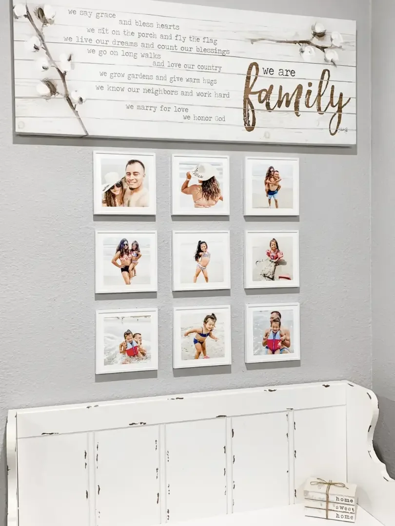
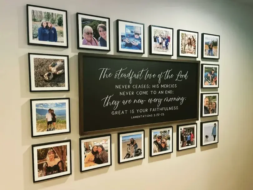
How can your photo book cover inspire a wall gallery?
Use your cover’s hero image as the centerpiece, then echo its colors and layout on the wall with a simple grid.
Mirror your book on your wall
Place the cover photo at the center as one tile, then flank it with complementary photos from inside the book. Use 3, 6, or 9-tile grids to reflect your album design.
Seasonal refreshes
Create a gallery for travel, family life, or baby milestones, then swap in new Mixtiles as your story evolves. No nails, no mess, and a fresh look anytime.
From proof to decor
After you approve your book cover design, turn that same image into a canvas tile or framed tile. Gallery Wall Kits on the Mixtiles site help you get balanced layouts fast.
Do you have a cover-ready checklist?
Run through this quick checklist before you send your book to print. It saves time and ensures your cover design looks perfect.
Final checks
Use this short list as your last pass before ordering.
- Is the story clear at a glance and the title easy to read;
- Are edges, bleed, and safe areas respected on all sides;
- Is color consistent and type hierarchy simple and scannable;
- Is the hero image high resolution and cropped intentionally.
Bonus polish
Add the date or place on the spine, align collage gutters precisely, and ensure the back cover stays clean for a modern look. For gifts, include a title card on the first page so the book feels like a keepsake album design that will be loved for years to come.
Your photo book cover is the handshake to your story. Lead with one emotive image, support it with a clear title and readable type, then choose finishes that feel as good as they look. When you find that perfect cover idea, bring it into your home decor too. Turn the hero shot into Mixtiles and enjoy your memories on the wall every day.
Make it unforgettable. Design your book cover, then turn the hero photo into a beautiful wall gallery you can stick, re-stick, and love for years. Get started.
Frequently Asked Questions
What should I put on my photo book cover?
Choose one hero photo or a clean 3 to 6 image grid, then add a short, specific title. Include a date, place, or surname on the spine. You can also go text-only with bold typography or a favorite quote. Keep high contrast and generous margins.
What makes a great photo book cover design?
A great cover tells a single story fast. Use a strong focal image, a concise title, and simple typography with high contrast. Give elements room to breathe, align edges, and pass the three foot test. If it reads instantly, you are winning.
Which photo book cover mistakes should I avoid?
Blurred or low resolution images, crowded collages, weak contrast, and fussy fonts reduce clarity. Placing text too close to trim, ignoring bleed, and inconsistent spacing also hurt polish. Clashing colors and forgetting the spine title are common too. Aim for 300 dpi and a clean hierarchy.
What photo book cover trends are popular right now?
Minimal full bleed hero images, bold type led covers, and restrained color pulled from the photo are popular now. Matte hardcovers feel premium, with subtle foil on print. Soft palettes for baby books, crisp black and white for weddings, and tidy grid collages lead current trends.
Be the first to know — deals, news & decor ideas.
By clicking you agree to the Terms of Use & Privacy Policy