
Maximalism Home Decor: How to Master the “More Is More” Look (Without the Mess)
Key Takeaways
- Maximalism home decor thrives on layered color, pattern, and personal collections, guided by a clear palette and focal points to avoid clutter.
- Start with walls: a bold paint or wallpaper plus a curated gallery wall delivers high impact fast; Mixtiles adhesive, repositionable frames make it renter friendly.
- Mix scales and textures, big florals, tight stripes, nubby textiles, glossy accents, and repeat colors throughout to keep cohesion.
- Build in phases: plan, place, edit, and refresh seasonally; repositionable frames and modular layouts let you evolve your space without damage.
Maximalism home decor is having a moment, and for good reason. It feels joyful, personal, and unapologetically layered. “More is more” only works when there is a method behind the magic. In this guide, you will learn how to build a bold, cohesive look room by room, from color strategy and pattern mixing to wall photo tiles and styled surfaces. We will share step by step tips, budget moves, and renter-friendly ideas to make a maximalist statement without holes, stress, or guesswork.
Ready to design a high impact wall in minutes? Create your own photo tiles. Download the Mixtiles app or start on desktop to upload photos, pick frames, and preview your layout, no nails required.
What is maximalism home decor, and why is it trending now?
Maximalism celebrates abundance and personality. It layers color, pattern, and collections in a curated way, which is why it is surging as people seek comfort, character, and creative self expression at home.
The core principles (abundance, personality, and contrast)
Maximalist home decor starts with abundance, but it is thoughtful abundance. You select bold colors, mix patterns, and display books, art, and keepsakes that tell your story. Personality drives the palette and the mix. Contrast gives the room energy: pair warm and cool tones, matte and glossy finishes, classic motifs and playful accents.
Maximalism vs. clutter: what separates curated from chaotic
Clutter lacks hierarchy. Curated maximalism uses anchors like a statement wall, a hero rug, or a large gallery layout to ground the eye. Repetition creates order. When your key colors and finishes appear in multiple places, the room feels intentional, not random.
2025 trend drivers: pattern drenching, color confidence, and statement walls
Designers are embracing full rooms wrapped in pattern, saturated paint on trim and ceilings, and expressive gallery walls that feel like murals. The look is elevated, but it is also accessible with renter friendly solutions like Mixtiles’ photo walls.
How do you pick a color story that lets “more” feel intentional?
Choose one dominant hue and two supporting hues, then repeat them across walls, art, textiles, and accessories. This creates rhythm, so your layers feel collected instead of chaotic.
Anchor + echo method (one dominant, two supporting hues)

Pick an anchor color that you love, then echo it with two secondary hues. If emerald is your anchor, you might echo it with cinnamon and powder blue. Use the anchor in larger areas like walls or a rug. Use the supporting hues in art, pillows, and drapery trim for balance.
Warm/cool balance so rooms feel energetic, not overwhelming
Rooms sing when warm and cool notes meet. A cool peacock wall can welcome warm brass, wood tones, and saffron textiles. If your palette runs warm, add cool relief with inky blues or slate. Keep metals consistent so the mix reads polished.
Where to go bold first (walls, rugs, or a gallery wall)
If painting feels risky, start with art. A striking gallery wall defines the palette and lets you test scale and color with zero commitment to paint. Mixtiles canvas prints can be repositioned as your scheme evolves. When you are ready, echo those colors on a rug or accent wall.
How can you mix patterns like a designer, and not clash?
Stack patterns by scale: one large, one medium, one small. Keep a shared color thread running through them, which ties the mix together without looking matchy.
Scale stacking: large print + medium motif + small texture

Start with a large floral or oversized geometric. Add a medium stripe or check. Finish with a tight herringbone or micro dot on a throw or ottoman. The variety creates depth without noise.
Stripe, check, floral: foolproof combos that always work
Stripes plus florals is a classic conversation. Checks plus botanicals feels playful and preppy. Animal spots pair nicely with vintage ikat. The key is cohesion through color. If each print carries one of your palette hues, the trio will harmonize.
Pattern “connectors” that tie rooms together (pillows, throws, art)
Use repeaters that travel across the room. A pillow with a hint of your wall color, a throw that matches an art accent, or a framed print that mirrors your rug tones all create visual bridges between zones.
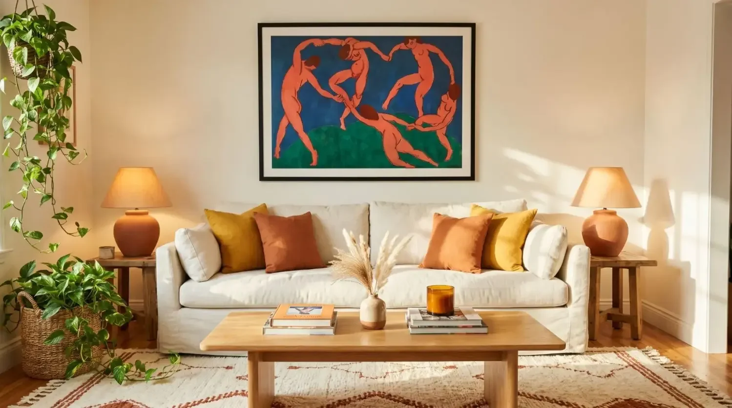
What is the fastest way to go maximalist? Start with your walls
Walls deliver the biggest visual return. A rich paint, a lush wallpaper, or a high impact gallery wall can transform a room in an afternoon.
Paint, wallpaper, or mural: choose your backdrop
Paint is fast and budget friendly. Wallpaper brings pattern immersion. A hand painted or printed mural acts like an instant focal point. If you rent, try removable wallpaper or use art to mimic a mural effect.
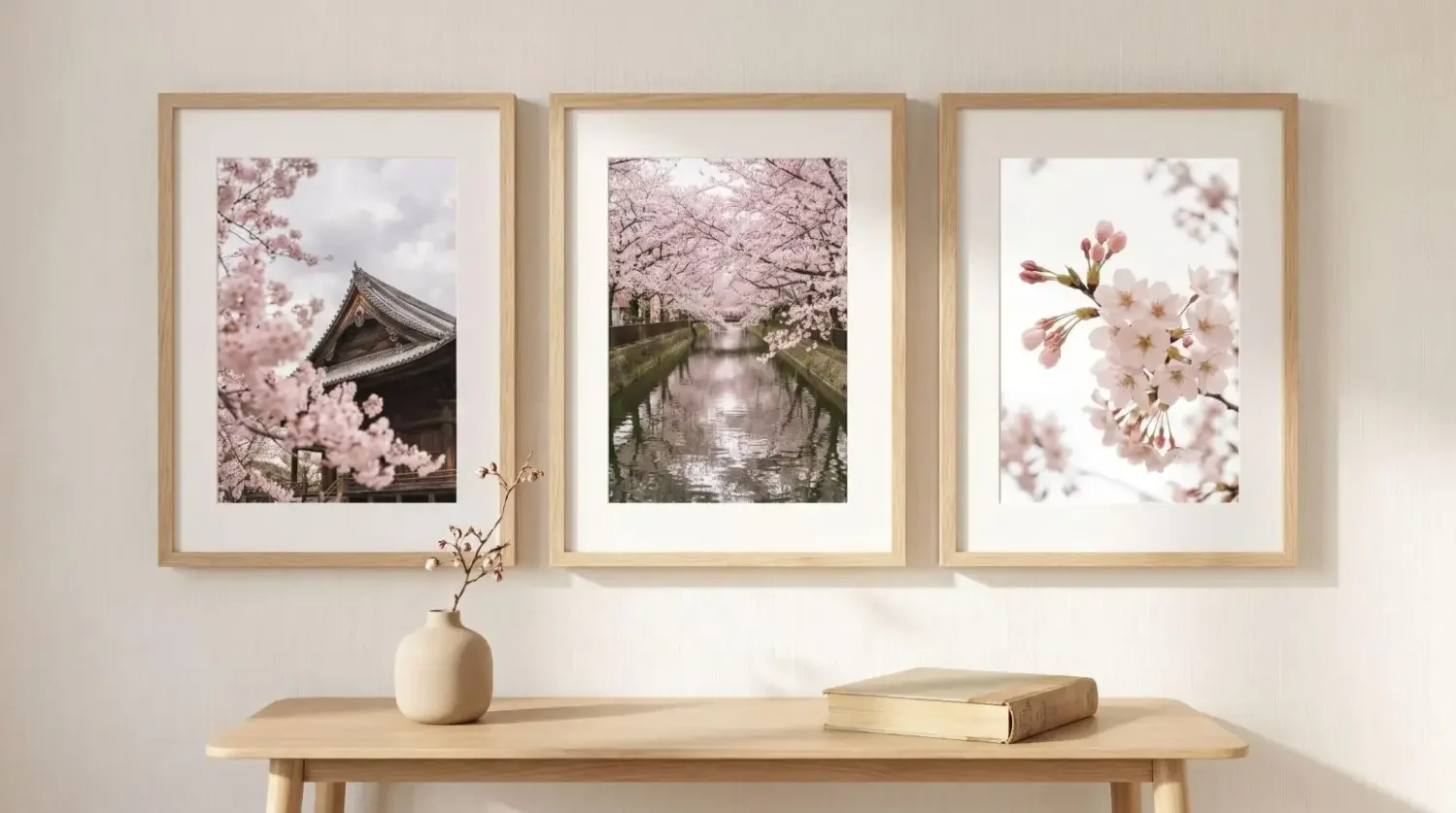
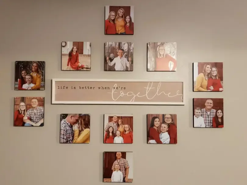
The maximalist gallery wall: your home’s storytelling hero

A gallery wall is the heartbeat of maximalist home decor. It blends family photos, travel shots, fine art prints, and bold abstracts into a personal tapestry. Start with a theme, then vary size and spacing for rhythm. Gallery walls simplify the process with curated layouts.
Why adhesive, repositionable frames make the style stress free
Mixtiles photo tiles are lightweight and mount with built in adhesive that sticks to most smooth walls like painted drywall, primed wood, and tile. You can remove and reposition without tools or damage, which invites experimentation and seasonal refreshes.
Try this: 3 gallery wall formulas for instant drama
Pick a layout idea that matches your wall size and style, then build with photos and art that repeat your palette.
- Grid of 6 to 12 tiles in a single finish for graphic punch;
- Salon style mix of sizes for a collected, European vibe;
- Color blocked layout that echoes your rug or sofa.
Gallery wall size planning table
Use this cheat sheet to estimate coverage and pick a layout that fits your furniture and wall:
|
Layout |
Tile Size |
Grid |
Approx Coverage, inches |
Approx Coverage, cm |
Best Above |
|---|---|---|---|---|---|
|
Compact Grid |
8 x 8 in |
3 x 2 |
26 x 18 |
66 x 46 |
Small console or entry bench |
|
Statement Grid |
8 x 8 in |
4 x 3 |
34 x 26 |
86 x 66 |
Queen headboard or loveseat |
|
Wide Grid |
8 x 8 in |
5 x 2 |
42 x 18 |
107 x 46 |
60 to 72 in sofa |
|
Salon Mix |
Mixed sizes |
Organic |
Varies, start near 48 x 36 |
Varies, start near 122 x 91 |
Large sectional or dining wall |
|
Canvas Statement |
24 x 36 in canvas |
Single |
24 x 36 |
61 x 91 |
Console or fireplace mantel |
Pro tip: keep art width at roughly two thirds the width of the furniture below for pleasing proportions. Planning a canvas instead of tiles? See our canvas sizes on wall guide to choose dimensions that fit your furniture and room scale.
How do you build a gallery wall that looks curated, not busy?
Curate by theme or color, anchor with a clear focal point, and vary sizes for rhythm. Repetition and breathing room keep the wall intentional.
Curate in themes: color family, subject matter, or mood
Pick a throughline. Try a warm toned travel series, black and white family portraits, or a jewel toned abstract collection. Mixtiles wall art makes it easy to add licensed artwork alongside your photos.
Vary size and spacing, rhythm beats perfect symmetry
Balance is more important than perfect alignment. A central hero piece with smaller works stepping outward creates flow. Keep consistent micro gaps between pieces so the wall reads as one composition.
Frame finishes for impact: black, white, wood, and mixed metals
Black frames feel graphic. White feels gallery clean. Wood warms the mix. You can even mix finishes carefully. Repeat each finish at least twice so the wall feels cohesive.
Mixtiles pro tips
Use these quick pointers to place with confidence and reduce guesswork:
- Map a focal line at eye level.
- Start from the center, build outward.
- Reposition until balance feels right, no wall damage.
Where should maximalism land first, living room, bedroom, or entry?

Start where you spend the most time or where guests enter. Living rooms benefit from big gestures, bedrooms from cocooning color, and entries from punchy first impressions.
Living room: statement rug, layered textiles, bold art wall
Let a saturated rug and a gallery wall define the zone. Layer pillows in your three palette hues. Add a large scale canvas print for a single punch, then echo its colors in your tiles.
Bedroom: canopy vibes with drapery, rich bedding, intimate gallery
Choose a calming anchor hue, then enrich with velvet throws and patterned shams. Place a tight grid of Mixtiles above the headboard for an intimate, tailored look.
Entry: micro mural effect with a tight grid and a console
A 3 by 2 or 4 by 3 grid above a narrow console delivers a mural like feel. Use travel photos or graphic posters to set the tone the moment you walk in.
Small space strategy: vignettes and jewel box zones
In apartments or studios, treat corners like mini galleries. A saturated paint color on one wall plus a compact grid creates a jewel box effect without crowding the room.
Can maximalism be renter friendly and low commitment?
Yes. Choose no nail solutions, removable textiles, and modular art. Mixtiles Photo Tiles and Canvas Prints with peel and stick or magnetic mounts make big style possible without tools.
No nail solutions for walls and ceilings
Use adhesive backed frames on smooth painted drywall, primed wood, glass, or tile. Avoid textured plaster or peeling paint. For ceilings or tricky surfaces, consult your lease and test an inconspicuous area first.
Peel and stick accents, removable drapery, and modular art
Peel and stick wallpaper panels, tension rods for drapery, and adhesive backed art let you try bold moves without permanent changes. When you move, take your collection with you.
Use Mixtiles to test bold palettes before you paint
Upload color rich abstracts or fine art prints that match the paint you are considering. Live with the look for a week. If the vibe is right, commit the color to a wall knowing your art already harmonizes.
Make your maximalist vision modular. Build stunning gallery walls you can rearrange anytime with our lightweight, adhesive frames. Upload photos, art scans, or digital prints and preview them on your wall in the app.
How do you style shelves, mantels, and tabletops the maximalist way?
Group objects by color or theme, vary heights, and add one larger anchor piece. Books, textiles, and sculptural shapes bring movement and depth.
The “triangle” rule for height and visual rhythm

Create gentle height peaks so the eye dances. A tall vase, a mid height stack of books with a bowl, and a low framed tile form a pleasing triangle. Repeat on the next shelf with different objects to avoid copy paste symmetry.
Books as building blocks, stacked, leaned, jacket colors

Use books as pedestals and color swatches. Stack a few to lift a small sculpture. Lean a cover with the same hue as your rug to reinforce the palette. Mix horizontal stacks with vertical rows for cadence.
Layer in sculptural elements, textiles, and plants

Bring in a ceramic bust, a woven basket, and a small trailing plant for life and texture. If you love a piece but the color fights the room, photograph it and print in black and white with Mixtiles for an artful compromise.
Edit test: Remove 20 percent, add one big anchor, then reassess.
When a vignette feels busy, remove a fifth of the items. Add one larger anchor like a tall vase or a framed canvas. The contrast of scale calms the composition.
What about textiles, rugs, and drapery, how layered is too layered?

Lead with texture first, pattern second. Combine a few rich textures, then add two or three patterns that repeat your palette for cohesion.
Mix textures first, then patterns, bouclé, velvet, linen, silk
Blend tactile finishes that invite touch. A bouclé chair beside a velvet pillow and a linen throw adds quiet luxury. Then weave in patterns that share one or two colors for a unified story.
Rug layering: natural base plus antique or graphic topper
Start with a large natural fiber rug like jute for grounding. Layer a vintage Persian or a bold geometric on top to add character and color. Align the top rug with your sofa for a crisp frame.
Drapery drama: color drenching with trims and tassels
Repeat wall or rug colors in drapery. Add contrast tape trim or tassels for a customized, maximalist flourish. Hang curtains high to make ceilings feel taller.
Should ceilings, doors, and trim join the party?
Yes, secondary surfaces act like jewelry. A painted ceiling, a lacquer like door finish, or contrast trim frames the room and elevates the art.
Painted ceilings and lacquered doors for a jewel box feel
Choose a shade lighter or darker than your walls to create a cocoon. Gloss finishes on doors bounce light and add glam. Test samples at different times of day before painting.
Contrast trim to frame the room like art
Trim in deep green, inky blue, or chocolate brown adds architecture even in builder grade spaces. Repeat that trim color in a few frames to connect the room to your gallery wall.
Tie ceiling and wall colors back into your gallery wall
Print abstracts or fine art that carry your ceiling hue. When the same tone appears in your tiles, the space reads as a cohesive whole.
Can you incorporate vintage and collections without visual noise?
Yes. Group by theme or color, tell a clear story, and rotate displays. Photograph treasures to create a clean, curated print series when objects cannot all be out at once.
Display rules: group by theme, color, or origin
Arrange travel ceramics together, keep brass objects in one vignette, or make a color block of cobalt glass. The grouping adds intent and makes dusting easier.
Rotate seasonally to keep displays fresh
Swap heavy pieces for lighter ones in warm months. Use Mixtiles to rehang art for fall or holidays. Rotations keep the look evolving while maintaining clarity.
Photograph your collection and print a curated series with Mixtiles
Shoot close ups of textures and details. A set of six coordinated photos reads like a museum study. Mix these with Mixtiles’ photo tiles to balance personal and professional imagery.
Story first sets: travel, family heirlooms, kid art, and pets
Build mini narratives. A travel wall by country, a heritage wall with scanned letters, or a playful wall of kids art and pet portraits turns memory into design.
How do you “pattern drench” a room without it feeling heavy?
Use one motif in multiple scales, add natural materials as breathers, and protect negative space around focal points.
One motif, multiple scales: wallpaper, pillows, chair piping
Repeat the same floral or stripe across different sizes. Wallpaper carries the largest scale. Pillows and piping echo it at smaller scales for harmony without monotony.
Neutrals as breathers: wood tones, stone, and matte black
Mix in walnut, marble, rattan, and matte black hardware to give the eye a place to rest. Natural textures relax even the boldest rooms.
Integrate negative space around your gallery or headboard
Leave a clean margin around major elements. A few inches of quiet wall around your gallery creates a halo that keeps the composition readable.
What is the step by step plan to build a maximalist room?
Work in phases: choose a palette, pick one big move, install art, layer textiles, then style and edit. This keeps momentum high and mistakes low.
Step 1: Define your palette and moodboard
Collect images and fabric swatches that repeat your chosen hues. Include a few Mixtiles Fine Art Prints to preview how art will anchor the palette.
Step 2: Choose one major statement, wall, rug, or sofa
Commit to one hero. If you pick a saturated wall, mirror that color in two or three art pieces. If the rug is the star, let the wall stay quiet while art carries the color repeats.
Step 3: Add a gallery wall that repeats your hero colors
Use a grid or salon layout. Combine personal photos with abstract prints or posters. Mixtiles’ website offers steps for choosing your canvas photo prints, including templates so spacing and alignment are simple.
Step 4: Layer textiles and mixed metals
Add pillows, throws, and drapery that echo your colors. Choose one dominant metal and one secondary. For example, polished brass as primary, matte black as secondary for definition.
Step 5: Style surfaces and edit with photos or videos
Arrange shelves and console vignettes. Take a quick phone photo or video. Editing is easier when you see the composition on screen. Adjust until the rhythm feels right.
60 minute refresh: swap Mixtiles layouts and throws for a quick seasonal shift
Rotate in spring florals or fall landscapes from your photo library. Reposition tiles to create a new focal point. Add a coordinating throw and candle to complete the mood.
What are the most common maximalism mistakes, and how do you fix them?
- Mistake #1: too many tiny items with no anchor. Fix: add one oversized piece, such as a large canvas or a bigger grid of tiles, to give the eye a home base.
- Mistake #2: clashing undertones that muddy the palette. Fix: check paints and textiles in natural light, align warm or cool families, and repeat metal finishes for clarity.
- Mistake #3: ignoring lighting and glare. Fix: plan ambient, task, and accent lighting. Aim picture lights or sconces to highlight art without causing reflections on glossy surfaces.
How can Mixtiles supercharge maximalism on any budget?

Start small, then scale. A capsule set of 6 to 12 Photo Tiles can grow into a full wall. Add seasonal artist-inspired prints or your own artwork over time. Reposition easily for parties or holidays.
Start with a capsule collection: 6 to 12 tiles in a single finish
A consistent frame finish creates instant cohesion. Choose high contrast black for punch or warm wood for cozy vibes. Build a tight grid for impact, then expand outward.
Expand over time with seasonal prints and artist collabs
Mix your photos with licensed fine art prints. Add winter landscapes, spring florals, or bold abstracts. The modular approach keeps your wall fresh without starting over.
Reposition for parties, holidays, and new color schemes
Hosting a birthday or shower, rearrange tiles to frame the dessert table. Switching rugs, rotate art to match the new palette. Zero holes means zero stress.
Ideas to print: bold abstracts, vintage posters, family portraits, travel film scans, kids’ art digitized
Curate a mix that feels like you. Combine a vintage poster with your honeymoon photos and a child’s drawing scanned to high resolution. The mix of personal and fine art is the heart of maximalist home decor.
Quick checklist: Are you ready to go “more is more”?
- Palette chosen: one dominant hue plus two supporting hues confirms direction and cohesion.
- One big statement: wall color, rug, or sofa chosen to act as your anchor for the room.
- Gallery wall plan: layout and frame finish set, content balances personal photos and fine art.
- Layers in place: textiles added, surfaces styled, and a simple three layer lighting plan confirmed.
Maximalism home decor is not about piling things on, it is about telling your story with intention. Choose a confident palette, layer textures and patterns, and use art to create rhythm and cohesion. Start with a high impact wall and build in phases, editing as you go. With Mixtiles adhesive, repositionable frames, you can experiment boldly, move pieces around, and grow your collection over time, no holes, no stress, just more of what you love.
Turn your photos and favorite art into a maximalist statement wall today. Design beautiful canvas prints or other unique wall arts. Download the Mixtiles app or start on desktop to design, preview, and hang your gallery. And that is without nails, damage, and most importantly, no drama.
Frequently Asked Questions
What does maximalism mean in home decor?
Maximalism celebrates layered color, pattern, and personal collections. It is not clutter, it is curated abundance guided by a clear palette and focal points. Repetition, contrast, and scale create order, while anchors like a statement wall or gallery layout ground the look.
How does the 3-5-7 decorating rule work?
The 3-5-7 rule favors odd-numbered groupings, they feel dynamic and intentional. Style shelves or mantels with 3, 5, or 7 pieces, include one anchor, vary heights and textures, and repeat a color. The result reads collected, not busy.
What is the 70/30 rule in interior design?
The 70/30 rule splits a room into dominant and accent layers. Let roughly 70 percent cover your main palette and big pieces, then 30 percent adds contrast through art, pillows, and metals. A modular gallery wall fits the 30, and Mixtiles make updates simple.
What is the 3-4-5 rule, and how do I apply it?
In practice, use the 3-4-5 guideline to layer confidently, three colors, four patterns, five textures. Choose one anchor hue and two supports, mix four prints across scales, then add five textures like wood, velvet, linen, glass, and metal for depth.
Be the first to know — deals, news & decor ideas.
By clicking you agree to the Terms of Use & Privacy Policy