
How to Arrange Art on a Wall: Pro Tips for Success
Key Takeaways
- Start with a plan: define a focal point, map sightlines, and use the 57 in/145 cm eye-level rule for single pieces and the center of groupings;
- Pick the right layout for your wall: grid, gallery, pairs/trios, or linear stacks and keep consistent spacing (about 2–4 in/5–10 cm);
- Balance art with furniture: hang 15–20 cm/6–8 in above pieces and size the arrangement to roughly 2/3 the furniture width;
- Test, tweak, and evolve without holes: Mixtiles adhesive, repositionable frames make layouts renter-safe and easy to refresh.
Love your art but unsure where it belongs? This guide demystifies how to arrange art on a wall: covering ideal heights, smart spacing, and the best layouts for every room. You’ll learn simple rules that feel good to the eye, common mistakes to avoid, and how to experiment freely using Mixtiles’ adhesive, repositionable photo frames for beautiful, damage‑free wall art.
Ready to design your wall? Open the Mixtiles app and try grids, galleries, or a triptych on your own gallery walls in seconds.
Where should you start when arranging art on a wall?
Begin by deciding what you want to see first, then build a layout that works with your furniture, light, and room flow. A quick plan prevents hanging art too high, too far apart, or off‑scale.
Map your focal points and room flow
Stand at the entry and note which wall grabs your view instantly. If your living room sofa, dining room buffet, or mantle is the star, let that area lead. Consider natural light and windows so glare won’t wash out photography or fine art prints; side light can make textures in paintings and prints pop and look rich. This simple mapping step will help create balance across all four walls. For real-world inspiration on proportion and sightlines, browse curated photo walls to see how different arrangements read from the room’s main entry.
Measure once, mock up twice
Measure the wall space and the furniture below it, then tape out the footprint at eye level on the wall or on paper laid on the floor. You can also preview scale in the Mixtiles app: drop in framed photos or artwork, try a grid or gallery wall, and adjust spacing before a single tile touches the wall.
What height should you hang wall art so it always feels “just right”?
Center most arrangements at eye level (about 57 in/145 cm from the floor) and keep pieces a comfortable 6–8 in/15–20 cm above furniture. Adjust for special cases like stairs, tall ceilings, and narrow halls.
The eye-level rule that rarely fails
The center of a single piece (or the center of a grouping) should sit at eye level. This classic interior design rule keeps your art placement grounded and your room feeling cohesive. If your household is very tall or very small, shift a bit, but avoid drifting too high.
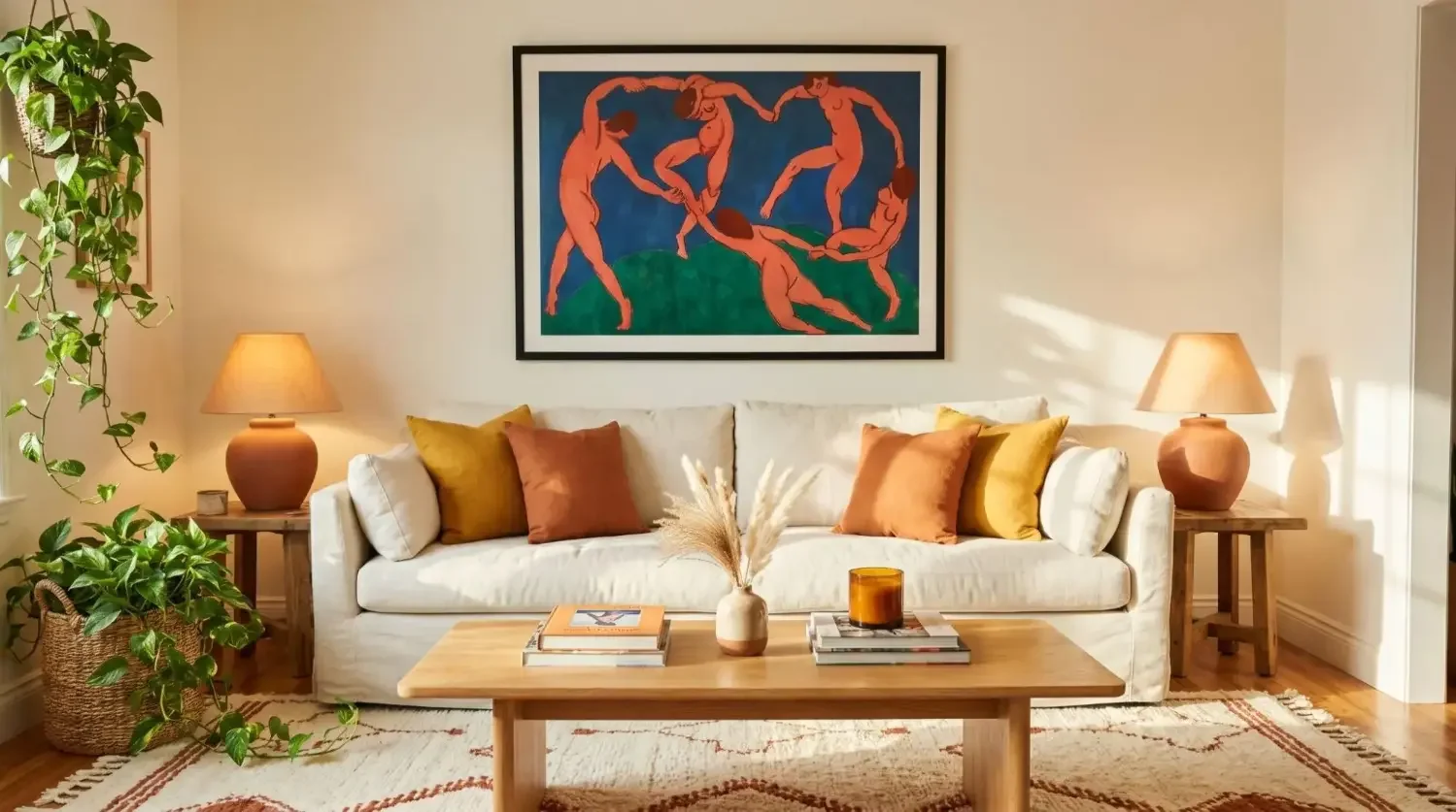
Over furniture and mantles
When hanging art above a sofa, console, or mantle, keep the bottom edge roughly 6–8 in (15–20 cm) above the furniture. Let the artwork span about two‑thirds the furniture width so it doesn’t feel either too small or overwhelmingly large scale.
Quick Reference: Heights, Spacing, and Scale
|
Rule |
Metric |
Imperial |
Use Case |
Example |
|---|---|---|---|---|
|
Eye level center; |
145 cm; |
57 in; |
Single piece or grouping; |
Framed picture centered in a hallway. |
|
Above furniture gap; |
15–20 cm; |
6–8 in; |
Over sofa, bed, mantle; |
Triptych above a queen headboard. |
|
Grid/gallery spacing (small/medium); |
5–8 cm; |
2–3 in; |
Mixtiles grids, gallery walls; |
3×3 grid in a studio or office. |
|
Grid/gallery spacing (large); |
8–15 cm; |
3–6 in; |
Large paintings and prints; |
Two large pieces either side of a mirror. |
|
Arrangement width vs. furniture; |
≈ 2/3 width; |
≈ 2/3 width; |
Over sofas, consoles, buffets; |
Low grid over a long sideboard. |
Special cases: stairs, tall ceilings, narrow halls
On stairs, keep the centers aligned parallel to the incline so the collection moves with you. In tall rooms, don’t chase height: stay near eye level so the grouping doesn’t float. In narrow halls, choose slimmer frames, a vertical stack, or a tight grid so the space still feels open and calm. Stair galleries also pair beautifully with keepsakes likewedding photo books, which extend the story along the railing without adding visual clutter.
Which layout fits your wall: grid, gallery, pairs, or trios?
Choose a layout that matches your wall size and style: symmetric grids look clean, organic gallery walls feel eclectic, and pairs or trios are the best quick win for small areas or over furniture.
When to use a symmetric grid

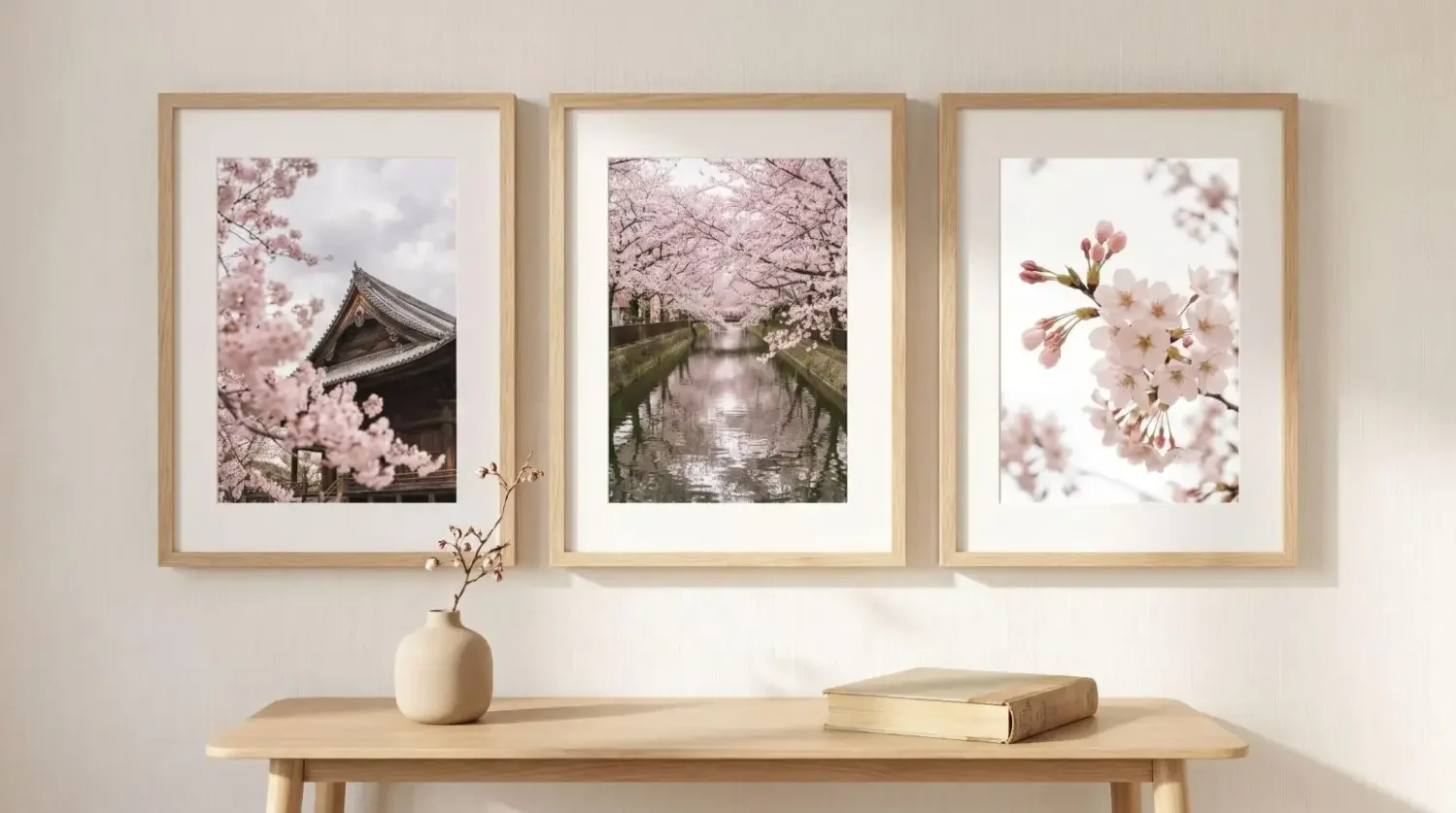
A grid is a beautiful way to keep things precise and modern. Equal sizes and equal gaps make the whole wall look intentional. Try a 2×2 over a console, a 2×3 above a sofa, or a 3×3 in a dining room for a strong statement.
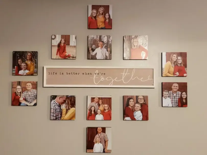
When to try an organic gallery wall

Start with one larger anchor piece, then mix smaller framed photos, prints, and a painting or two around it. Keep the outer silhouette loosely balanced and repeat frame colors to tie different styles together. Gallery walls are a great way to showcase a personal collection without it feeling too busy. If you want a few ready-to-mix pieces to round out the look, explore complementary wall arts that echo your palette and frame tones.
Pairs, trios, and triptychs

Hanging two equal pieces side by side is classic and calm; a trio or triptych adds rhythm across a long wall. On consoles or sideboards, echo the theme with a coordinating small photo book to keep the vignette cohesive without overcrowding the wall. Keep the centers aligned and the spacing consistent so the arrangement reads as one cohesive piece.
Linear and stacked arrangements

A horizontal line looks serene above a sofa, while a vertical stack works wonders between windows or in a narrow wall space. Both approaches are simple, good choices when you want art to feel architectural.
Want a ready-to-hang look? Explore Mixtiles Gallery Wall Kits and Canva Prints, curated layouts you can put up in minutes.
How much space should you leave between frames?
Keep gaps consistent. For small or medium frames, 5–8 cm (2–3 in) feels balanced; for larger frames, 8–15 cm (3–6 in) lets each piece breathe. Maintain identical gaps in grids and visually similar gaps in galleries so the whole composition feels considered.
Leave a little breathing room from door trim, switches, and corners so the arrangement doesn’t feel cramped. If a piece looks too far from its neighbor, step back and re-center by eye; a few millimeters can make a huge difference in how the wall looks and feels.
How do you arrange art above furniture without it looking awkward?
Match the art’s width to the furniture, hang at a comfortable level, and keep the composition connected to the piece below so it doesn’t float.
Over a sofa, aim for an arrangement about two‑thirds the sofa’s width, with the bottom edge 15–20 cm above. For beds, anchor to the headboard; a low grid or a triptych is a great way to fill the area without going too high. Consoles and buffets love centered art and a little vertical help from lamps, sconces, or a mirror for height. On a mantle, one large piece or a tight grid reads confident and clean.
How do you make all four walls feel cohesive, not copy-paste?
Vary the configuration on each wall while keeping a common thread like a frame color, palette, or subject matter. The room will feel curated, not repetitive.
Think one large single on the main wall, a grid on another, a small gallery on the third, and perhaps a sculptural object or mirror on the fourth. Repeating black frames, a warm neutral palette, or related photography subjects will tie everything together so the whole room works in harmony. Tie the room together by repeating a subject across formats—framed prints on the wall and a matching coffee table photo book for tactile balance.
Renting or design-shy? How can you arrange without nails or stress?
Use removable systems so you can test and tweak layouts without damage. Here’s what makes Mixtiles ideal for hanging art with zero holes:
- Adhesive, repositionable frames that stick to most painted walls and come off cleanly;
- Lightweight photo tiles and canvas prints that are easy to place, move, and replace;
- App previews and ready-made Gallery Wall Kits that simplify planning and placement.
What tools and steps make hanging art simple?
Gather a few basics, plan your grid on paper, then place pieces at eye level and adjust by eye from a step or two back.
Use this brief list so you don’t get stuck midway through a project:
- Tape measure, level, painter’s tape, and a soft pencil for light marks;
- Paper templates for complex galleries; mark centers, spacing, and bottom height;
- Clean, dry walls so adhesive grips well; avoid rough brick or heavy texture;
- For heavier non-adhesive frames: choose proper wall anchors based on wall type.
What common mistakes should you avoid?
A few small missteps can make even beautiful pieces feel off; fix the basics and everything else falls into place.
Remember these practical tips when you want to hang new art or create a gallery wall:
- Don’t hang too high or leave gaps that are inconsistent;
- Don’t ignore furniture scale; tiny art over a long sofa can look lost;
- Don’t cram every wall; negative space is your friend;
- Don’t skip planning: measure, mock up, then place with confidence.
Arranging wall art becomes simple when you start with a clear plan, use reliable measurements, and pick a layout that suits your wall and furniture. Vary configurations across the room for interest, keep spacing consistent, and let negative space do its job. With Mixtiles’ adhesive, repositionable frames, you can test how to arrange art on a wall and evolve your walls as your style grows, without tools or stress.
Design your wall in minutes, no nails, no stress. Open the Mixtiles app or start on our website to map your layout, add photos, and order photo tiles delivered to your door.
Frequently Asked Questions
What’s the simplest way to arrange art on a wall?
Pick a focal point, plan around your furniture, and center pieces at eye level (about 145 cm/57 in). Choose a layout (grid, gallery, or pairs) keep spacing consistent (5–10 cm/2–4 in), and mock up first.
What is the 57-inch rule for hanging art?
Hang the center of a single piece (or the center of a grouping) at roughly 57 inches (145 cm) from the floor. This anchors art to a natural sightline so rooms feel cohesive. Adjust slightly for household height, but avoid drifting too high.
What is the 2/3 rule for hanging pictures?
Size your artwork or grouping to about two-thirds the width of the furniture beneath it. For example, above a 90-inch sofa, aim for a ~60-inch-wide arrangement. Keep the bottom edge about 6–8 in (15–20 cm) above the furniture so it doesn’t float.
How does the 70/30 rule apply to gallery walls?
Use 70% consistency and 30% contrast. Let most pieces share a frame color, spacing, or palette, then introduce variety with a few sizes or accents. This mix keeps the wall cohesive but lively and helps you avoid overcrowding.
Be the first to know — deals, news & decor ideas.
By clicking you agree to the Terms of Use & Privacy Policy