
How Big Should Art Be on a Wall: Simple Sizing Tips
Key Takeaways
- For blank walls, aim for art that’s 60–75% of the usable wall width; keep the center around 57–60 inches from the floor;
- Above furniture, choose art 2/3–3/4 the furniture’s width and hang it 4–10 inches above the top;
- Build gallery walls with 1.5–3 inches between pieces and leave an 8–12 inch margin from adjacent edges or moldings;
- When in doubt, go a size larger, or use modular Mixtiles to scale up, test layouts, and reposition without damage.
Sizing wall art feels tricky, but a few simple rules make it easy. In this guide, you’ll learn exactly how big should art be on a wall, whether it’s a blank space, above a sofa or bed, or a gallery wall. We’ll show the math-free shortcuts, plus quick formulas if you want them. And because Mixtiles are adhesive and repositionable, you can size, place, and tweak your layout stress-free.
Ready to turn photos and art prints into perfectly sized wall art? Start a layout in the Mixtiles app to preview, hang without nails, and adjust in minutes.
What’s the fastest way to size art for a blank wall?
The best way is to fill 60–75% of your empty wall space and place the center at eye level (roughly 57–60 inches from the floor). This rule of thumb for hanging creates a balanced, gallery-quality look without complicated math.
Use the 60–75% rule
Measure the usable width of your wall (omit windows, door trim, and tall furniture). Multiply that width by 0.60 to 0.75 to get the ideal total width for your artwork or group. Keep the vertical placement simple: place the center around 57–60 inches from the floor, or align with a chair rail if your room has one. On tall walls, you may nudge the center toward 60 inches so the composition doesn’t look like it’s floating too low.
A quick example
Say your blank wall is 100 inches wide. A good target width for your wall art is 60–75 inches. You can reach that with one big piece, a three-part series (triptych), or a Mixtiles gallery grid sized to that span. If ceilings are high or the room is large, sizing up toward the 75% end will make a stronger focal point.
How big should art be above a sofa, bed, or console?
As a general rule, choose artwork that’s 2/3–3/4 the width of the piece of furniture underneath and hang it 4–10 inches above the top. This keeps the art connected to the furniture and prevents awkward gaps.
Follow the 2/3–3/4 rule
Measure the furniture width, then multiply by 0.66–0.75 to find your ideal art width. For example, above an 84-inch couch, aim for about 55–63 inches of total art width. A single oversized canvas print, a framed art print, or a row of Mixtiles can all hit that “right size” sweet spot.
Hang at the right height
Leave 4–10 inches between the bottom of the artwork and the top of the furniture to visually connect the two. Keep the artwork’s center at eye level (57–60 inches). In a living room with very tall ceilings, place the center closer to 60 inches so the composition reads properly from across the room.
Quick size chart: Recommended art width above common furniture (2/3–3/4 rule)
|
Piece of furniture |
Width (in) |
Width (cm) |
Recommended art width (in) |
Recommended art width (cm) |
|---|---|---|---|---|
|
Twin bed |
39 |
99 |
26–29 |
66–74 |
|
Full bed |
54 |
137 |
36–41 |
91–103 |
|
Queen bed |
60 |
152 |
40–45 |
102–114 |
|
King bed |
76 |
193 |
50–57 |
127–145 |
|
Sofa |
72 |
183 |
48–54 |
122–137 |
|
Sofa |
84 |
213 |
55–63 |
140–160 |
|
Dining table |
60 |
152 |
40–45 |
102–114 |
|
Dresser |
48 |
122 |
32–36 |
81–91 |
|
Console table |
60 |
152 |
40–45 |
102–114 |
|
Fireplace opening |
36 |
91 |
Match 36 |
Match 91 |
Want a done-for-you layout? Explore Mixtiles gallery wall kits. Curated sizes, built-in spacing, and templates that make hanging easy in any room.
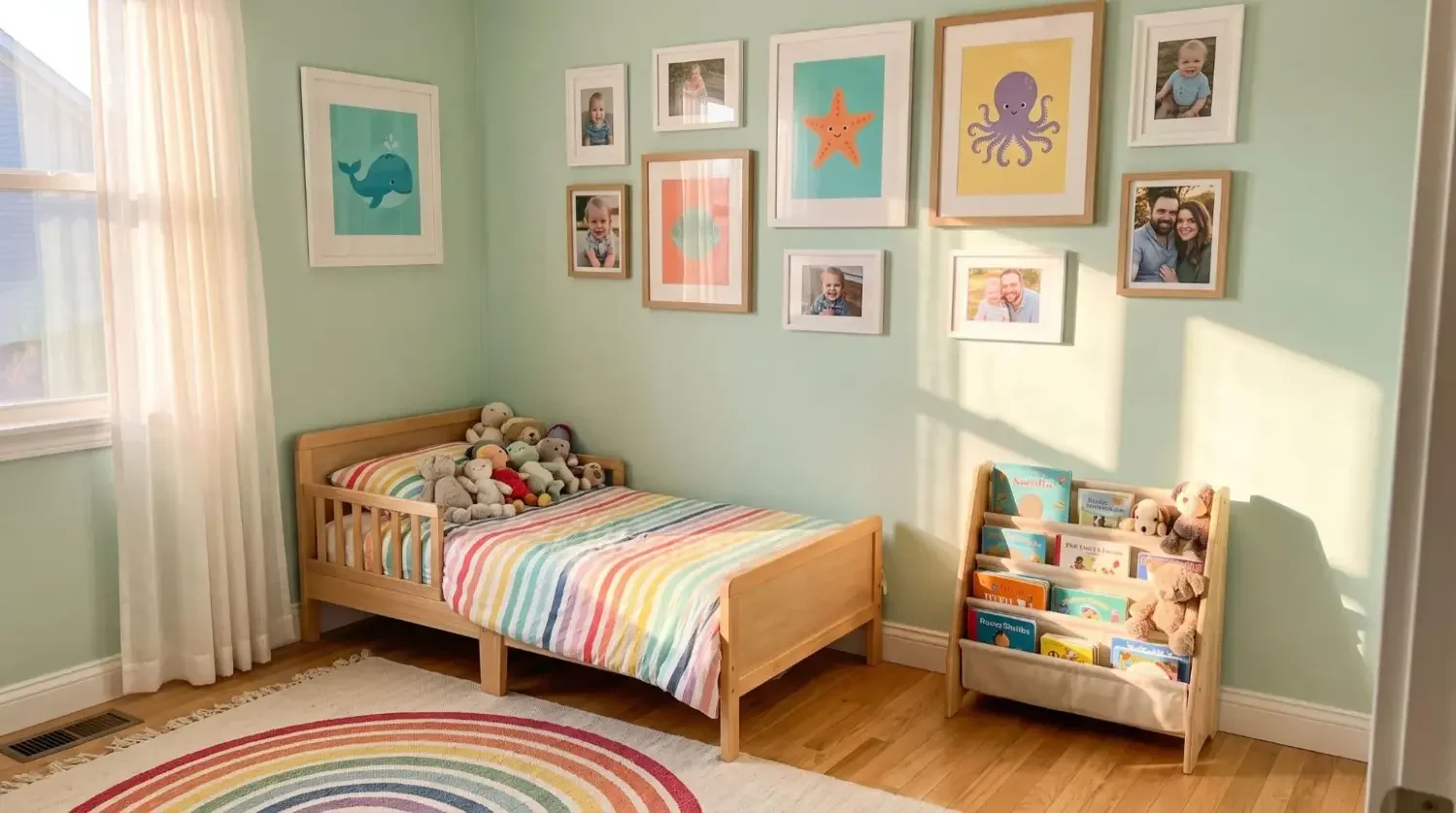
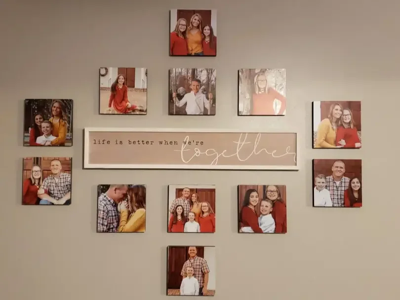
How do I size and space a gallery wall without guesswork?
Treat the entire gallery as one big piece: size it to 60–75% of your wall (or 2/3–3/4 of the furniture width), keep the center near eye level, and use consistent gaps; typically two to three inches between larger works and a bit less for smaller pieces.
Pick your layout: grid or organic
A grid gives a clean, modern look with equal rows and columns; perfect for square Mixtiles and framed art. An organic salon-style gallery mixes sizes and orientations around a visual center, which is great when you want a more creative, eclectic feel with pictures and prints collected over many years.
Nail the spacing and margins
For a professional result, keep 1.5–2 inches between smaller pieces and about three inches between larger pieces of art. Leave an 8–12 inch margin from nearby corners, door casings, or moldings so the gallery doesn’t look crowded. On large walls, slightly larger margins will make the composition breathe.
Mixtiles math: how many tiles do I need?
Here’s the best way to size a modular gallery without overthinking it.
- Decide your target width using the rules above;
- Estimate tiles across by dividing target width by one tile’s width plus your planned gap;
- Add rows until your group height feels balanced, then place the center at 57–60 inches.
Because Mixtiles stick and restick without nails, you can adjust spacing after you hang; ideal if your room has tricky trim or a console table that sits higher than expected.
What about hallways, stairwells, and other tricky walls?
In tight or vertical space, go slimmer and taller. Stack pieces vertically to add height, or run a rhythmic series along the line of travel. Keep the center near eye level as you move through the space so the composition doesn’t feel too high or too low.
Hallways and narrow walls
For narrow walls, lean into vertical space with a stacked set or a slim grid. Keep gaps tight so the works connect visually from far away. If a chair rail is present, align the bottom or center of your grouping so it relates elegantly to that horizontal line.
Stairwells
Follow the incline and “step” your art so the centers rise consistently as you climb. Smaller pieces work better here; they’re easier to hang, they’re safer on angled walls, and they reduce glare from stair lighting.
Should I size up or split into multiple pieces?
When a blank wall feels empty even with furniture, sizing up creates a bold focal point that can define your design. In a long living room or over a large wall, a diptych, triptych, or modular series spreads the visual weight so the composition doesn’t look like one big picture afloat in space. Mixtiles make this easy: start with a couple of tiles, add more pieces as you refine, and rearrange without damage if your style changes.
How does orientation change the look and feel?
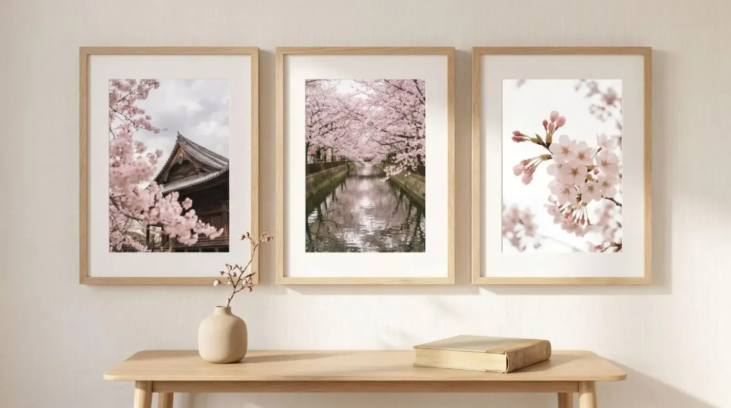
Portrait (vertical) artwork adds height and suits tight vertical space between windows; landscape (horizontal) pieces widen the view and look great behind a couch, dining table, or dresser. Square frames are versatile anchors in a gallery: mix them with vertical and horizontal works to balance movement while keeping spacing consistent. Keep in mind that framed art and mats add size, so your finished width may be larger than the print alone.
How can I visualize the size before I commit?
Mock it up at full scale before you hang. This is the easiest way to make sure the size you choose looks right from across the room and that the center lands where you want it.
Use tape and paper to preview your composition before ordering or hanging.
- Tape an outline at your target width and height, placing the center around 57–60 inches;
- Step back 8–10 feet and view the wall from typical sightlines (sofa, bed, or entry);
- Adjust until the proportions feel right, then translate that mockup into final sizes.
Or use the Mixtiles app to lay out a gallery, swap sizes, and preview spacing digitally. Because Mixtiles are lightweight, you don’t need studs or nails; they’re great for renters, drywall, and most painted walls. For brick or textured walls, our peel-and-stick or magnetic mounting canvas options may be a better fit (always make sure the surface is clean and dry before hanging).
Getting wall art size right is mostly about reliable rules. For blank walls, fill 60–75% of the span; over furniture, go 2/3–3/4 the width; place the center near eye level (57–60 inches); and keep spacing consistent. With Mixtiles, you can learn, plan, and hang your design in minutes, then update it whenever inspiration strikes without holes or hassle. That’s the easiest answer to how big should art be on a wall.
Build your perfect-size gallery wall today. Open the Mixtiles app or visit Mixtiles.com to design, preview at scale, and order adhesive, repositionable frames that go up in minutes.
Frequently Asked Questions
What does the 2/3–3/4 rule mean for wall art sizing?
When hanging art above furniture, choose a piece or grouping about two-thirds to three-quarters the furniture’s width, and hang it 4–10 inches above. This keeps the look connected and balanced. For blank walls, a similar idea: fill roughly 60–75% of the usable wall width.
What is the 57-inch eye-level rule?
The 57-inch rule places an artwork’s center at about 57 inches from the floor (average eye level) so pieces align visually across a room. In spaces with tall ceilings or where you view from farther away, nudging the center toward 60 inches often reads better.
How do I know if my art is too small for the wall?
Art is likely too small if it covers less than half the wall span, or less than two-thirds of the furniture width beneath it. When in doubt, size up or build a gallery arrangement; consistent 1.5–3 inch gaps help smaller pieces read as one larger composition.
How can I use the golden ratio when hanging wall art?
The golden ratio (≈1.618) can fine-tune proportions. For galleries, aim for a layout where the longer side is about 1.6 times the shorter, or let your focal piece follow that proportion. It’s optional: standard rules (60–75% width; 2/3–3/4 over furniture) still look great.
Be the first to know — deals, news & decor ideas.
By clicking you agree to the Terms of Use & Privacy Policy