
How Many Gallery Walls is Too Many? Find Your Balance
Key Takeaways
- “Too many” depends on sightlines, scale, and cohesion: aim for 1–2 gallery walls per shared sightline, balanced with large anchors and negative space;
- Plan by zone, not by room: coordinate themes, colors, and frames so walls complement rather than compete;
- Watch for clutter signals (tiny pieces everywhere, no focal point, inconsistent spacing) and fix fast by editing, anchoring, and unifying frames;
- Repositionable frames like Mixtiles make trial-and-error easy: stick, step back, and restyle without nails, damage, or commitment.
Wondering how many gallery walls is too many for your home? The short answer: fewer than you can see at once, unless you plan them to work together. This guide turns “it depends” into clear rules you can test in minutes. From an open living room to a small apartment, use these stylist-approved ideas (and Mixtiles’ adhesive, repositionable frames) to experiment, edit, and land on a gallery wall design you’ll love every time.
Ready to try a risk-free layout? Shop Mixtiles for your photo gallery wall and get a curated look in days.
What actually counts as “too many” gallery walls?
A gallery wall is multiple pieces arranged as one composition. The real question isn’t a fixed number: it’s how much visual activity your space can handle at once. If you can see more than two busy gallery walls from a single spot, they’ll likely compete. Within any sightline, pair one gallery wall with a large piece of art or a calmer blank wall. Minimalists and maximalists can both win here: the guardrails are cohesion, scale, and spacing, not strict limits.
How do room size and sightlines change the answer?
Room size, ceiling height, and the way spaces connect matter more than how many walls you have. Plan by sightline: what you see at one time should feel like one story, not a shouting match.
Open-concept spaces
Use zone planning so the entry, living, and dining areas each tell their own story. Make neighboring galleries distinct: try a clean grid in the living room and a looser salon around the dining wall. Leave at least one calmer wall per zone for visual rest, so the whole gallery feels intentional rather than busy.
Small apartments and hallways
In a small room, one strong gallery is usually the best move; then add a mini-gallery in a hallway or over a console. In narrow halls, keep frames slimmer, tighten spacing, and align centers at 57–60 inches from the floor so everything feels orderly, not cramped.
Bedrooms and nurseries
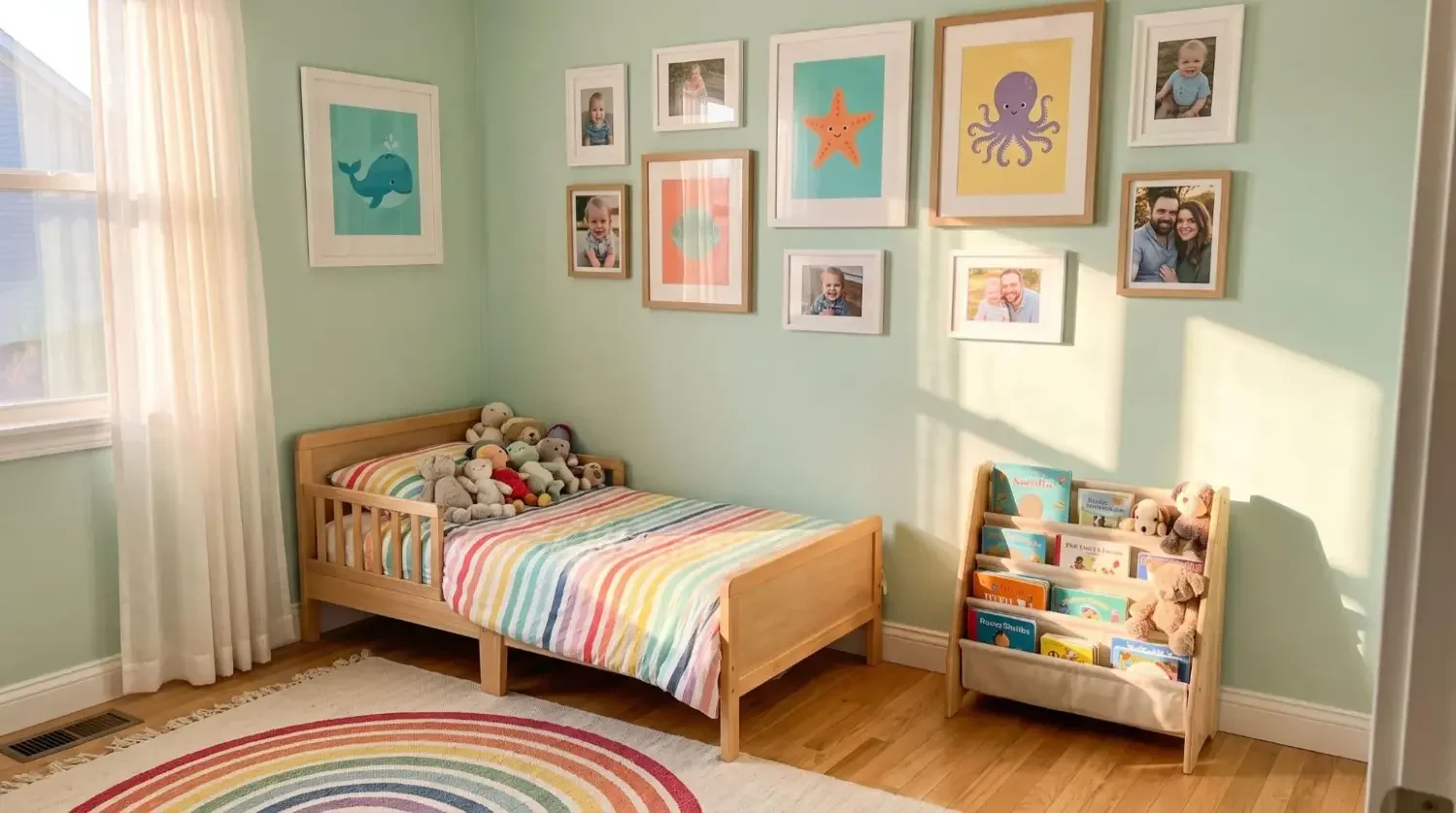
Opt for softer palettes and fewer pieces above beds for serenity and safety. Lightweight, stickable frames are a great choice over cribs or changing stations, and you can move them as your little one grows or as your decor evolves.
Can you mix multiple gallery walls without visual clutter?
Yes, when galleries share a unifying thread and each wall plays a different role. Think theme, layout, and color harmony so the look feels curated, not chaotic.
Unify through a theme

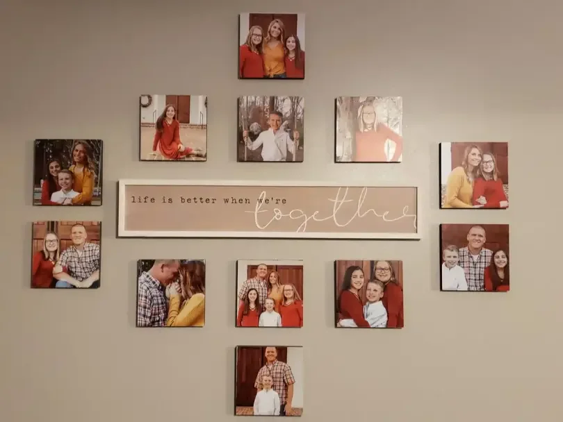
Choose a clear throughline: family photos, travel moments, botanicals, kids’ art, or monochrome memories. Unify with a single element (consistent frame color, matching mats, a cohesive color palette, or similar subject matter) so many pieces act like one.
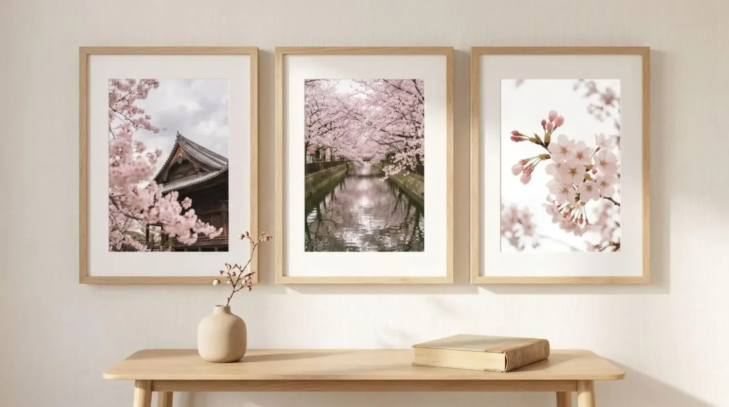
Choose a layout that complements the room

Grids and picture ledges bring calm, modern structure; salon-style layouts add character and a little maximalist energy. Keep margins consistent (about 2–3 inches in grids, visually even gaps in salons) so the gallery looks made to measure.
Color and contrast that work

Follow a 60–30–10 palette: 60% wall color, 30% frames/mats, 10% accent colors in the art. If two walls share a sightline, limit extreme contrasts between them. That way, your eye doesn’t ping-pong around the room.

Is there a simple formula to decide how many gallery walls you need?
Use three simple rules: the 1–2–1 Rule per sightline, the 70% Rule per room, and the Big-to-Small Ratio. Together, they make it easy to know when to add another gallery, and when to stop.
The 1–2–1 Rule (per sightline)
In any view, aim for one statement gallery, one calm wall, and one large anchor piece. If you already have two large, busy galleries in view, reset the next wall with negative space or a single oversized piece.
The 70% Rule (per room)
Fill no more than about 70% of available wall area with art. Leaving 30% blank helps your gallery look intentional. In a living room, that might mean one gallery wall and one or two large prints elsewhere.
The Big-to-Small Ratio
Balance lots of small pieces with at least one large anchor. For example, if your gallery wall is built from many little frames, add two large canvases across the room to ground the space.
Quick checks
Use these fast tests before you commit to nails or permanent hooks:
- From the doorway, identify one clear focal wall; if you can’t, edit until one wall leads;
- If your eye jumps around too much, remove a row, tighten spacing, or switch one wall to a single oversized piece.
Helpful sizes and spacing for balanced gallery walls
|
Mixtiles Format |
Common Size (in) |
Common Size (cm) |
Recommended Gap |
Best Use |
|---|---|---|---|---|
|
8 x 8 |
20 x 20 |
1.5–2 in (4–5 cm) |
Small walls, hallways, master bedroom accents |
|
|
Photo Tile (Large) |
11 x 11 |
28 x 28 |
2–3 in (5–8 cm) |
Living room feature walls, above sofa |
|
16 x 20 |
40 x 50 |
2–3 in (5–8 cm) |
Anchors to balance a busy gallery |
|
|
Canvas Print (Oversize) |
24 x 36 |
60 x 90 |
Solo |
Single statement on a blank wall |
Want a foolproof start? Try Mixtiles gallery wall kits. Templates, frames, and layout ideas, delivered to your door.
What are the telltale signs you’ve gone too far, and how do you fix them?
If every wall is equally busy, you may have crossed the line. Look for a missing focal point, lots of small mismatched frames, or themes that clash within one sightline. The fix is simple: edit, unify, and anchor.
Signs of “too many”
No single gallery leads the room; your eye jumps from wall to wall. You’ve got tiny pieces scattered everywhere, inconsistent spacing, and frame styles that don’t speak to each other. Themes might fight (say, neon posters next to vintage botanicals) making the room feel like a flea market, not a gallery.
Fast fixes
Edit 20–30% of the composition and regroup. Shift a busy salon to a calmer grid, or park a few pieces on a picture ledge. Unify frames in black, white, or natural wood. Add one large piece of art (a 24 x 36 canvas or a mirror) to ground the gallery. Leave at least one wall mostly clear to let the room breathe.
How do lifestyle factors (kids, rentals, and frequent redecorating) change the plan?
Safety, flexibility, and wall type matter. With kids or in a rental, lightweight, adhesive frames are your best friend because you can move them without damage.
Kid-friendly choices
Hang the bottom row above curious hands and active play zones; avoid heavy frames over beds or slides. With Mixtiles, you can raise or lower a layout as your child grows, and you won’t worry about nails near the crib or the floor.
Renters and nail-averse decorators
Skip holes altogether. Mixtiles stick, re-stick, and come down clean on most painted drywall; for brick or textured walls, test a tile first. If you love to refresh your decor, adhesive frames let you try a new gallery wall layout any time without repairs.
How can Mixtiles make “test, tweak, and love it” effortless?
Mixtiles were made for experimentation. Stick, step back, and restyle in seconds: no tools, no measuring tape drama. Cohesive frame styles, mats, and sizes help a room look put-together fast, whether you’re building one gallery or two large complementary walls. Design in the app or on the website, preview layouts, and get fast shipping from our D2C shop. Over the years, we’ve helped millions turn a blank wall into a space they feel like home in, and we can do the same for your living room or master bedroom.
So, how many gallery walls is too many? The answer is simple: as many as your sightlines can support while staying cohesive. Balance one gallery with calm neighbors, anchor small pieces with something large, and leave room to breathe. When in doubt, edit until one wall leads. With Mixtiles’ adhesive, repositionable frames, you can test new ideas and get the look you love without commitment or damage.
Ready to design a gallery wall you’ll love? Create your Mixtiles now: photo tiles, canvases, and fine art prints that go up in minutes and move whenever you do.
Frequently Asked Questions
What’s the rule of thumb for hanging a gallery wall?
Start with museum height: place the gallery’s visual center about 57 inches from the floor (average eye level). In taller rooms or over furniture, 57–60 inches (or 6–8 inches above a sofa or headboard) works well. Build around that center with consistent gaps.
Are gallery walls out of style in 2025?
Not at all; they’re evolving. 2025 favors curated cohesion: cleaner grids or ledges, unified frames, tighter spacing, and intentional negative space. Cluttered, mismatched collections read dated. Repositionable frames (like Mixtiles) make it easy to refresh layouts without patching holes.
Can I have more than one gallery wall in the same room?
Yes: manage sightlines. From any single viewpoint, aim for one statement gallery and keep neighboring walls calmer or use one large anchor piece. If two galleries compete in the same view, edit, unify frames, or simplify one wall to restore balance.
How much of a wall should art cover to avoid “too much”?
Leave 30–40% of the wall blank and cover the remaining 60–70% with art. This breathing room keeps galleries intentional, not busy. If you’re using many small pieces, balance them with at least one oversized anchor to ground the composition.
Be the first to know — deals, news & decor ideas.
By clicking you agree to the Terms of Use & Privacy Policy